Sunday, 22 May 2011

Pt1, Assignment - Contrasts

I found this assignment quite tricky to complete, partly because it took much longer than I anticipated and partly because I approached it think it 'wouldn't be too difficult'.  In the process of completing the assignment I took over 200 photos, many of which were somewhat experimental.  Some worked, some didn't, but all taught me something.

All the images for this assignment can be seen full size in this set on Flickr

High / Low
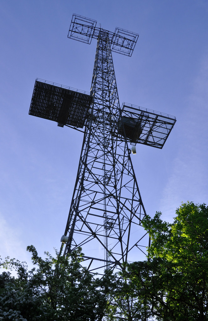
High/Low High, f/16, 1/80, 24mm
The high image is of a historic radar tower that was originally erected during the 2nd World War are formed part of the 'Home Chain' radar defences.  This photos was taken early in the day so that the sun was low and it lit the scene from a low angle.  This emphasised the height of the subject by illuminating the lower parts, especially the trees to the right.  The gentle sweep of the structure skywards emphasised the height too.

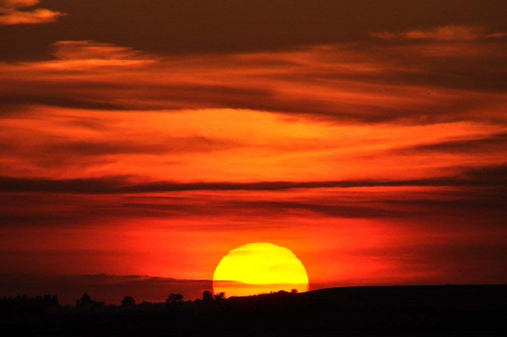
High/Low Low, f/13, 1/640, 500mm
For the contrasting low photograph, I've used this picture of the sun setting, viewed from Whitstable which I took on a holiday there.  A very long lens was used to give the sun a larger presence in the frame and the black ground at the bottom of the picture gives a good reference to the lowness of the sun in the sky.


Hard / Soft
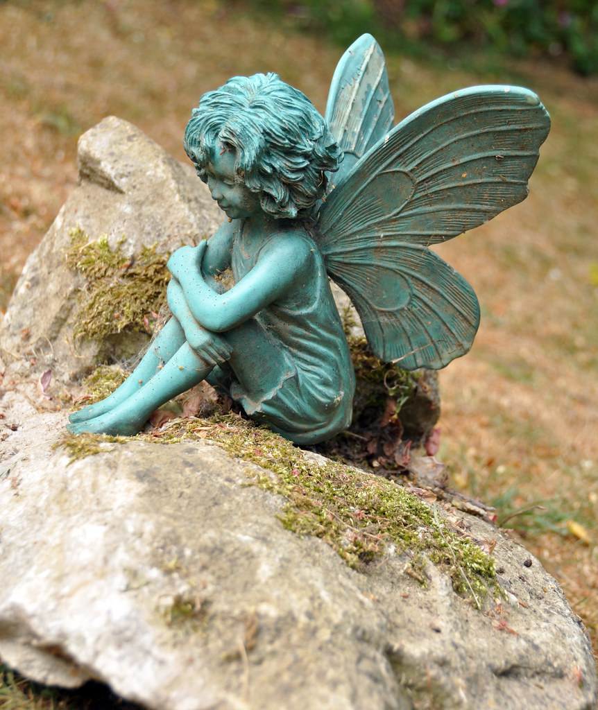
Hard/Soft Hard, f/4.5, 1/320, 44mm
The Hard image shows a garden ornament sitting on a rock.  The hardness of the rock is clear to see and the fairy also is clearly a hard object .  This is evident by the distinct edges and deep shadowing that show up the detail of the subject.  From this we can clearly see that the object to not soft in any way.

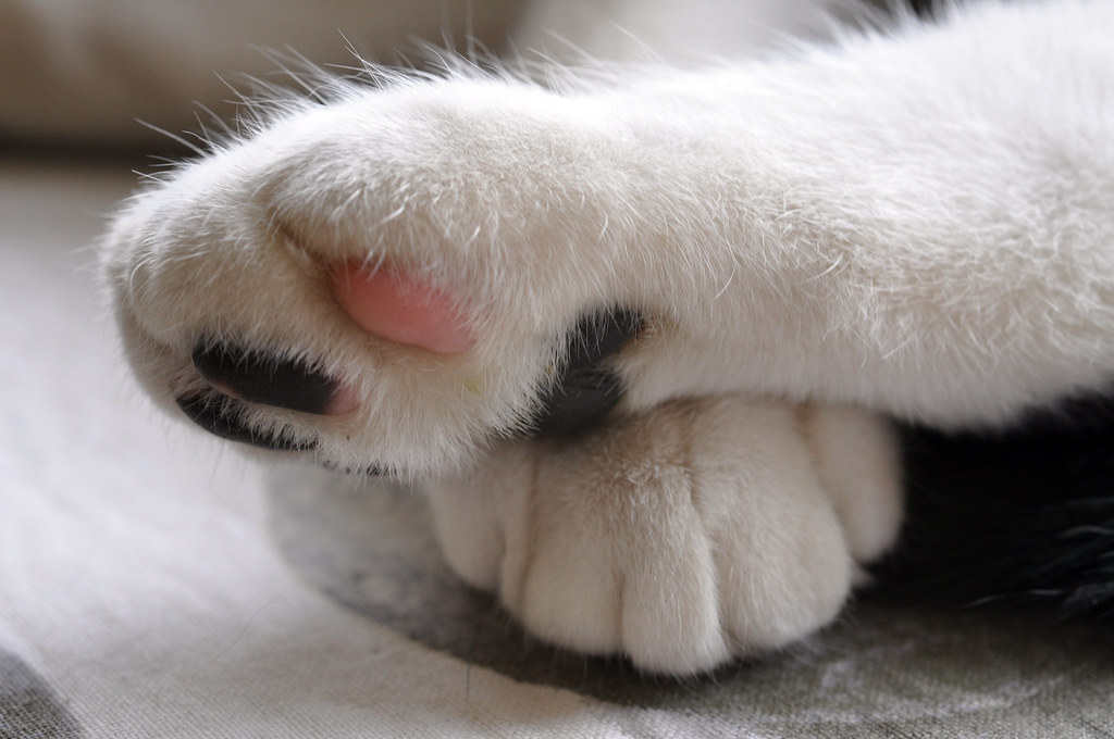
Hard/Soft Soft, f/8, 1/50, 50mm
The soft image is of our cat's paws.  I took this with a macro lens so that I could emphasise the detail of the fur.  This together with the pink pad on the bottom of the paw really convey the softness of the subject.  As you can imagine, an animal will not pose for a photo, so many pictures were taken.  I chose this one as there was plenty of detail that brought out the softness of the subject and because the paws being crossed made for a much more interesting photograph.


Many / Few
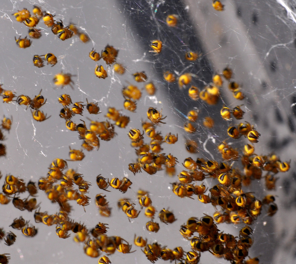
Many/Few Many, f/16, 1/60, 50mm
The photo I took to represent many is of a cluster of recent hatched spiders that I found on our wheelie bin.  A macro lens was used to get a close shot of the spiders, but as a consequence there is little depth.  The image certainly conveys the theme of 'many' and I believe it is interesting as a casual glance would leave the viewer intrigued as to what the subject was.

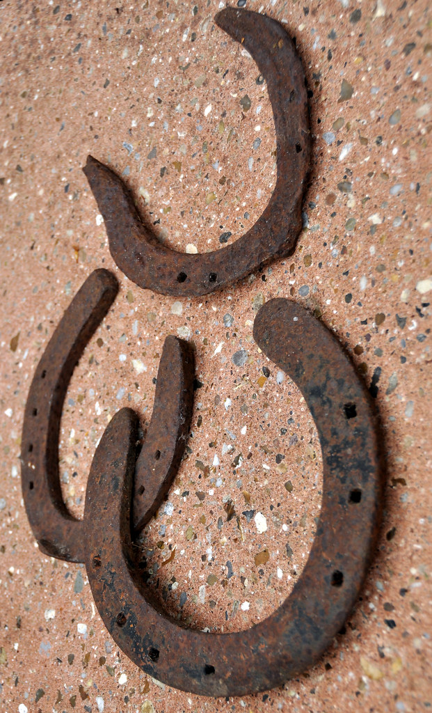
Many/Few Few, f/4.5, 1/320, 44mm
For the contrasting 'few' image, I've used 3 old horse shoes.  By turning the camera round and shooting from an unconventional angle, the horseshoes almost appear to be defying gravity.  I also physically separated the most decayed shoe, whilst deliberately connected the others.  This suggests a connection between the joined items and isolation of the third


Liquid / Solid
Liquid/Solid Liquid, f/5, 1/320, 75mm
This liquid shot shows water falling in front of a Magnolia.  To capture the image I pre focused in front of the background at the spot where I was going to pour the water.  To get a 'sheet' of falling water, I used a rectangular container and tipped the water out carefully.  The resultant image captures the fluidity of the water as it falls.

Liquid/Solid Solid, f/10, 1/125, 200mm
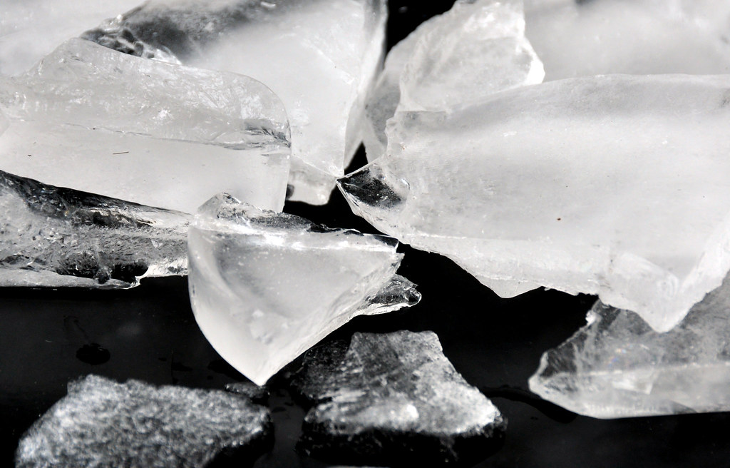
For the contrasting Solid, I froze some water, then smashed it to create chunks to photograph.  The sharp edges of the ice clearly demonstrate that it is a solid and as it is clearly frozen water, contrasts well with the very fluid liquid image.

Black /White
Black/White Black, f3.2, 1/50, 50mm
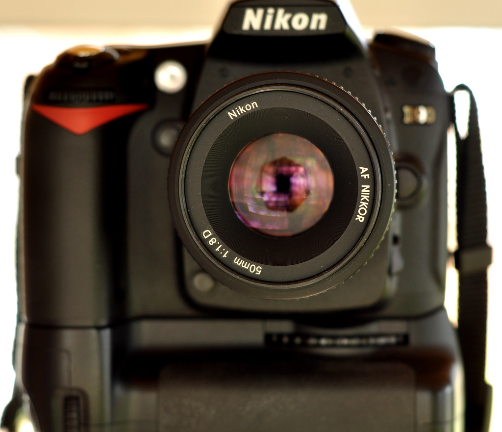
After quite a lot of searching, I used what was right in front of me for the Black image - my camera.  I set this up on a tripod in front of a mirror an manually focused on the tip of the lens I was using.  The timer setting was used to take the photo so that no fingers would detract from the blackness of the camera.  The bright border emphasises the black too.  The image was also reversed in Photoshop so that the lettering is the correct way round for the viewer.

Black/White White, f4, 1/320, 50mm - Lensbaby lens
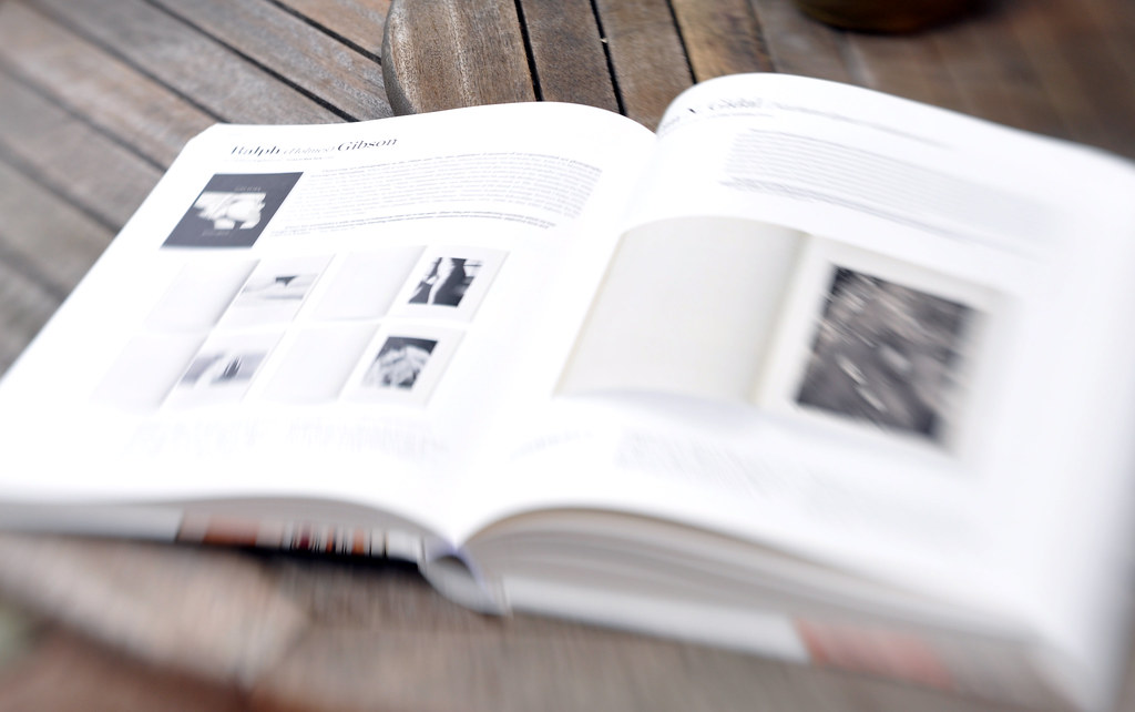
For the contrasting white image, I took this picture of a book using a Lensbaby lens.  The lens tilts, throwing large areas out of focus and introducing blur to the image.  This blurs much of the greys in the book and really brings out the emphasis on the whiteness of the pages

Rough / Smooth
Rough/Smooth Rough, f/6.3, 1/640, 50mm
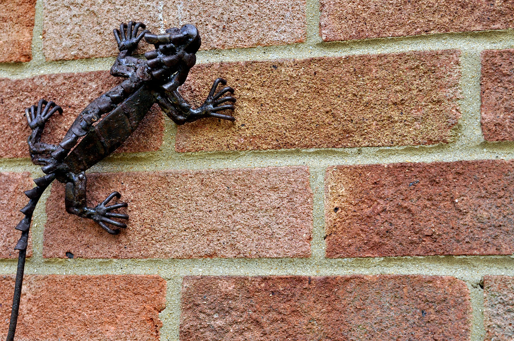
The Rough image is of bricks, which are instantly recognisable as rough.  I also includes an ornamental lizard made of rusting metal to add another element of roughness and give the image some interest.

Rough/Smooth Smooth, f/6.3, 1/2, 50mm
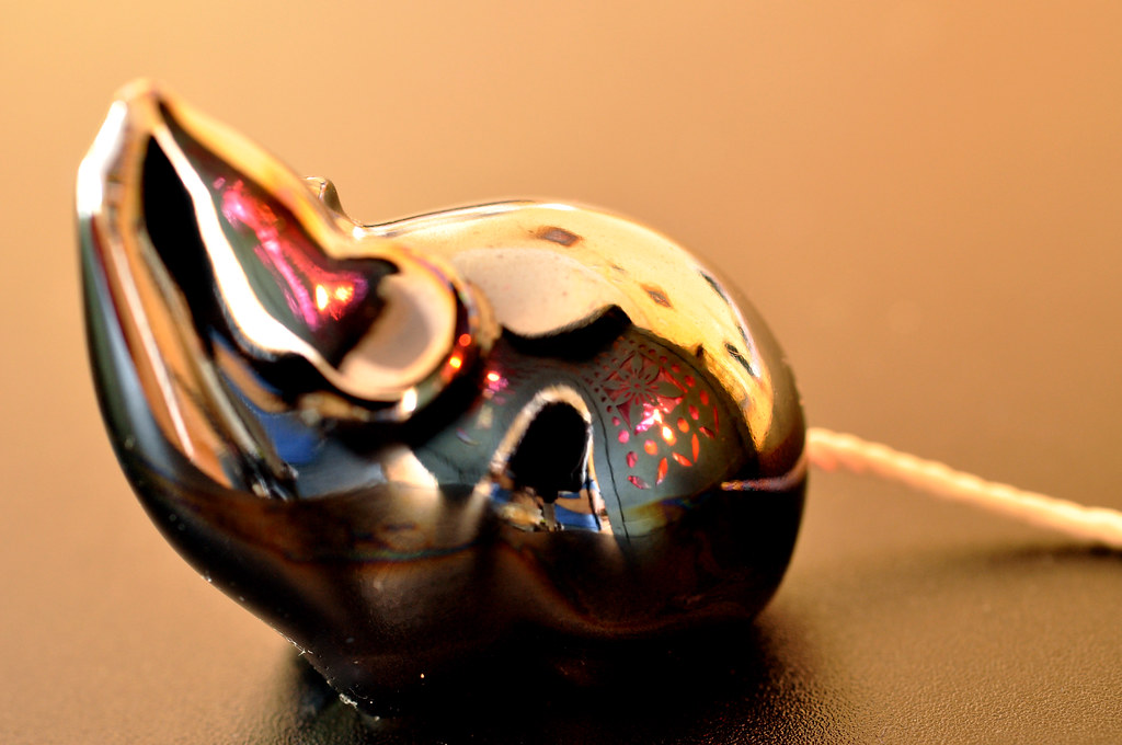
The contrasting smooth image is of an ornamental mouse.  This has a smooth metallic finish and to add another dimension to the photo I positioned a lantern close by to give some interesting reflections and emphasise the smoothness.  The long exposure without flash adds warmth to the image.

Heavy / Light
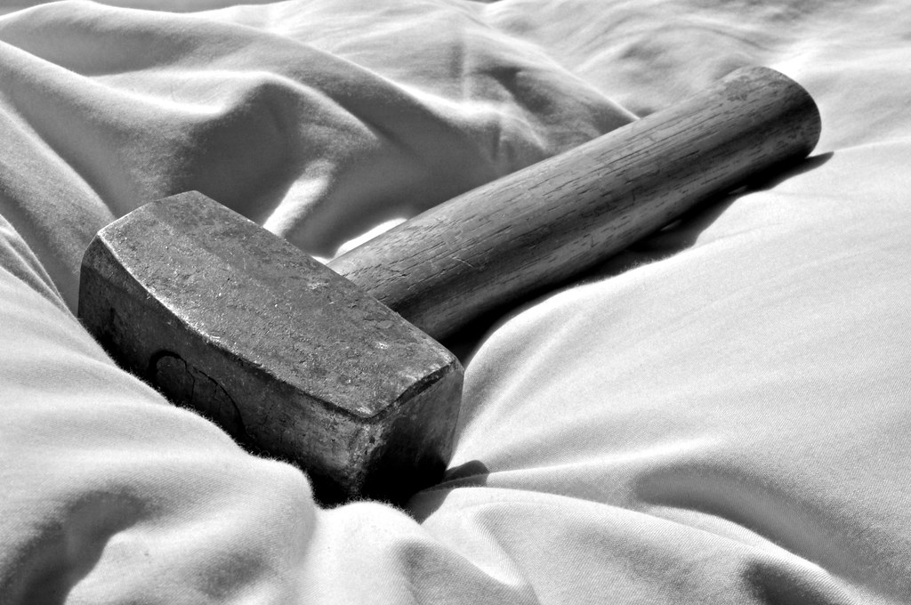
Heavy/Light Heavy, f/20, 1/80, 50mm
The heaviness of the hammer is enhanced by placing it on a soft pillow.  We all know a hammer is heavy, but if it was on a hard surface, we would rely on our assumption that it is heavy rather than any direct visual clues.  The weight can be clearly seen by the way in which the hammer is pushing down into the soft pillow

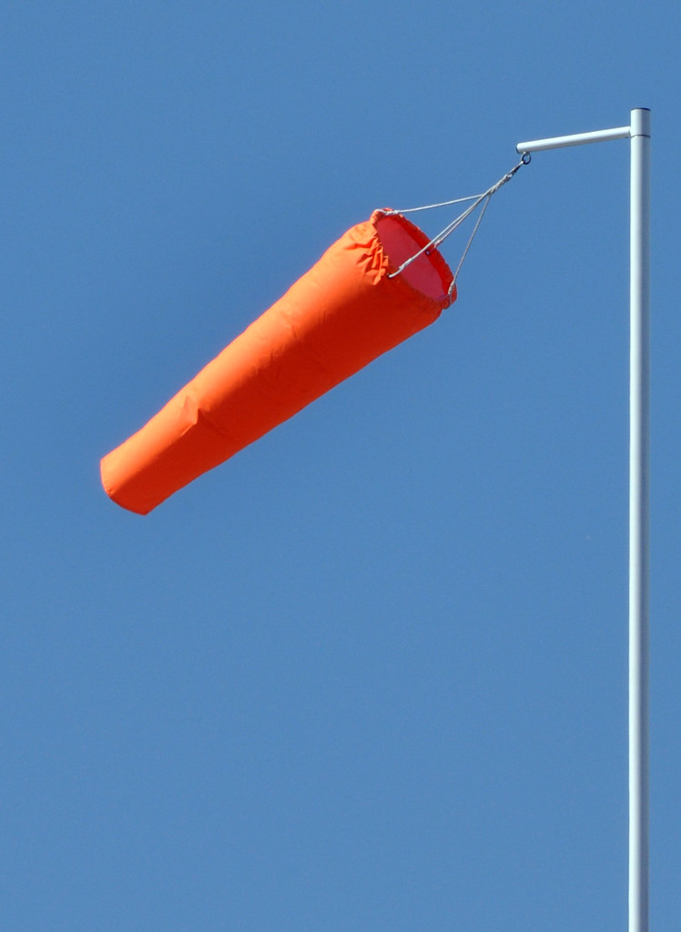
Heavy/Light Light, f/20, 1/160, 200mm
The light contrast to the heavy image is of a windsock.  We can see that the object must be light as it is clear that wind is supporting the windsock and there are no other supports.  By isolating the windsock and it's pole from the surroundings (it's actually on top of a sports hall), we have a very simply, clear image.  The straightness of the pole give a good reference to the position of the windsock itself and hence it's lightness


Straight / Curved
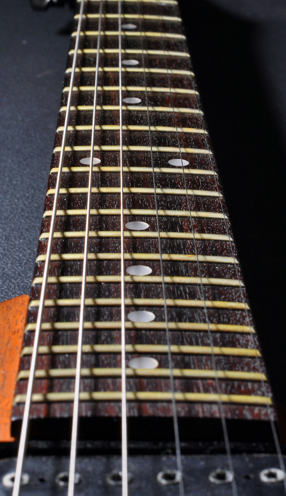
Straight/Curved Straight, f/14, 1/60, 50mm
I chose to photograph the strings and neck of a guitar, the parallel lines of the strings graphically showing their straightness.

Straight/Curved Curved, f/4, 1/250, 10mm
The contrasting curved image is of some stairs underneath a road.  Although there are straight lines in the picture, the spiral curing of the stairs is dominant.  By removing colour, a more industrial feel is given to the image and shows good contrasts, enhancing the curve.


Contrasts in one image - Continuous & Intermittent
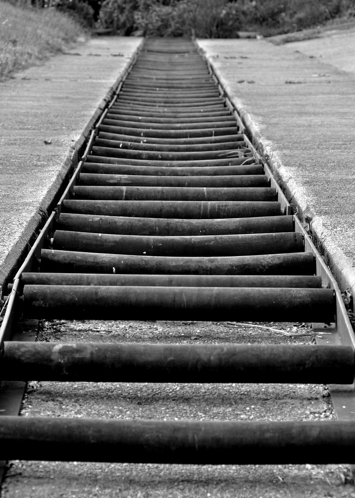
Continuous and Intermittent f/11, 1/60, 135mm

This is an image of a construction to for small boats and canoes to bypass a weir. It consists of a series of rollers, which provide the intermittent aspect to the picture.  This contrasts to the straight, continuous edges.  Additionally, the intermittent rollers, become continuous by repetition.  The use of black and white works well as the subject is falling into disrepair and lends itself to a monochrome image

This assignment was quite a task to complete, but has been time well spent.  Contrasts can be so easily overlooked or assumed and this has encouraged me to look more closely at them for future photography
Monday, 4 April 2011

Pt 1, Ex 9 Cropping

This exercise proved far more difficult and time consuming than I imagined.  I had difficulty choosing photographs top crop and looking through my images, it became apparent that I mostly take tightly framed photos, even thought I have a 10-20mm wide angle lens.

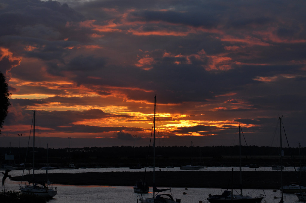
Wells Next The Sea Pre Crop.jpg, 85mm, 1/320, f7.1
The first photograph I chose for cropping is of a sunset at Wells-Next-The-Sea in Norfolk.  Although the clouds and sky colour are dramatic, I feel that the water is slightly distracting.
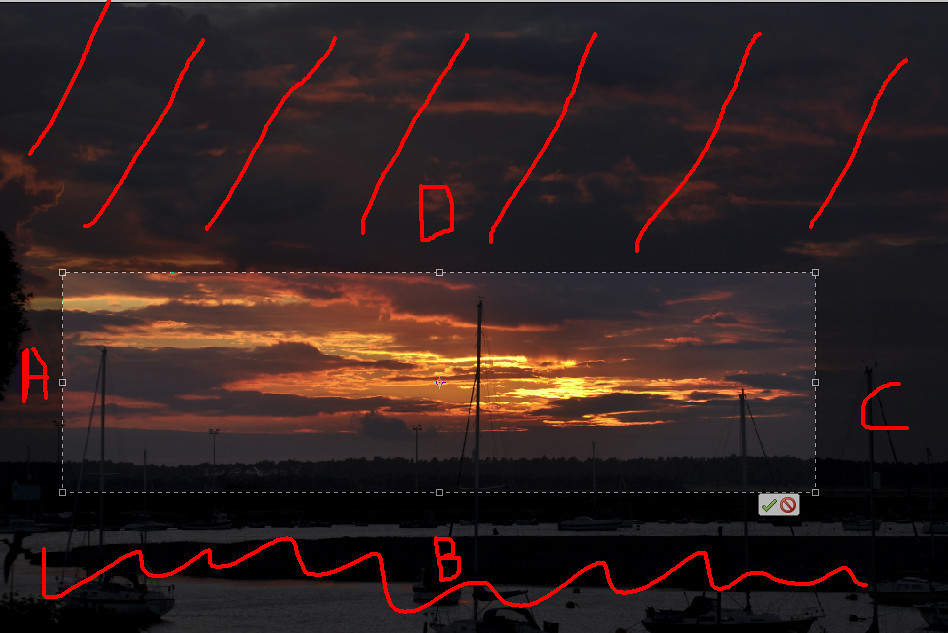
For the cropping, I removed areas A and C to include only 3 masts on the boats.  This added some balance to the image.  Area B was removed as it contained the distracting water, that made the lower portion of the photo appear cold and in contrast with the sunset.  Finally area D removed much of the sky, leaving only the most interesting area, emphasising the bright, sunlit edges, of the clouds.

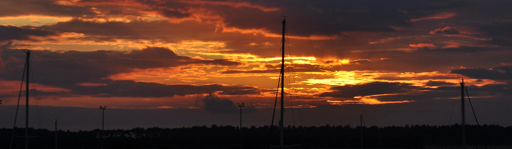
The resultant image is dramatically different to the original, looking more vibrant and has a greater impact with a narrower range of colour.  Despite no enhancements being made to the image between original and the cropped version, there appears to be greater contrast in the image.


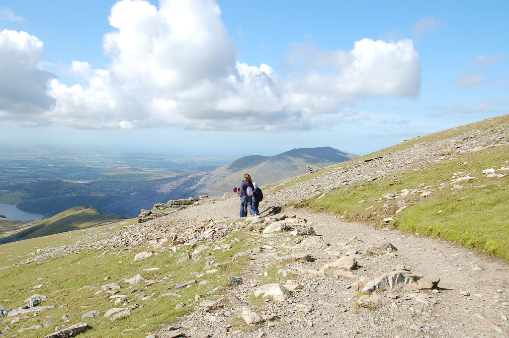
Snowdon Pre Crop.jpg  26mm, f9.0, 1/320
The next image was taken on Yr Wyddfa, more commonly known as Snowdon during a family holiday.  As it stands, its an average 'snapshot' with no particular thought given to framing.

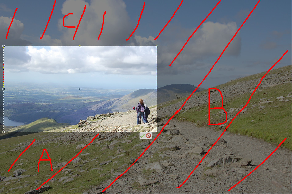
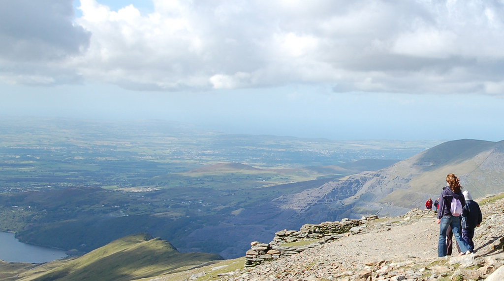
Cropping removed large parts of the foreground (A) and the slope (B) top the right of the image.  These were not particularly interesting and dominated the image.  The path was also eliminated in the foreground, despite leading the eye towards the figures.  Finally, some of the sky (C) was removed.

The cropped image is greatly changed.  The foreground and rising ground to the right dominated the original, but after cropping the image is transformed to be all about the view into the distance.  The figures are clearly taking in the sight before them.  There is only the merest hint of mountain behind or to the right now.

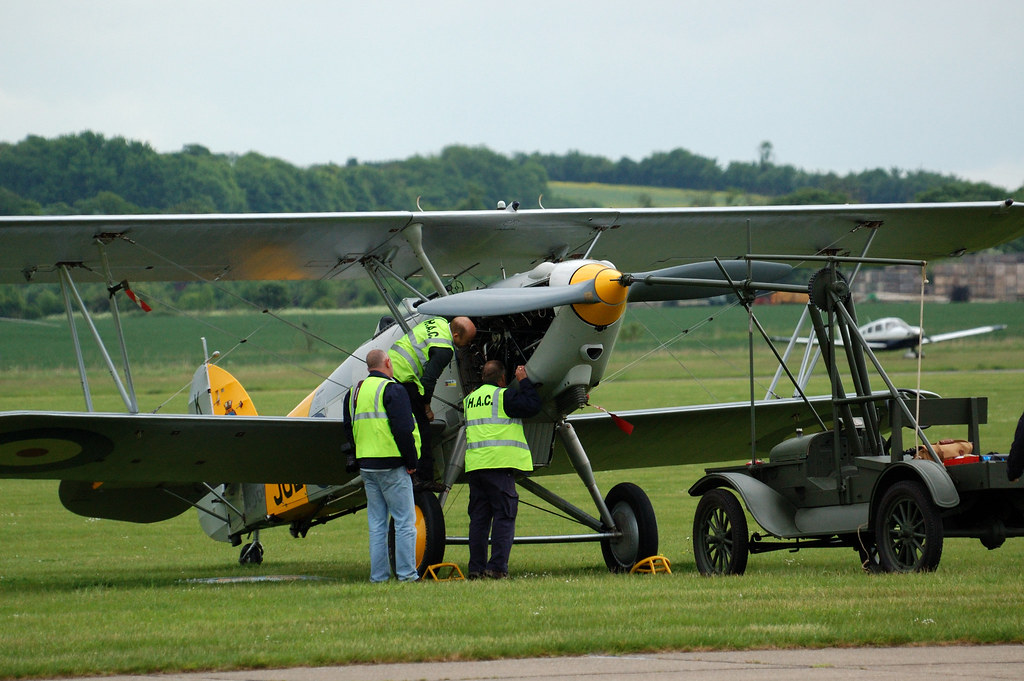
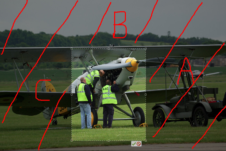
Duxford Spring Air Show Pre Crop.jpg  270mm, f6.3, 1/2000
This photo was taken at an air show at the Imperial War Museum, Duxford in Cambridgeshire and shows some people working on a vintage aeroplane before it's participation in the show.  The photo itself is somewhat cluttered, although it clear what is happening.  In hindsight, it would probably have been better to bring the view back slightly if the aircraft, etc were to be included to the degree that they were as it doesn't quite work as it stands.

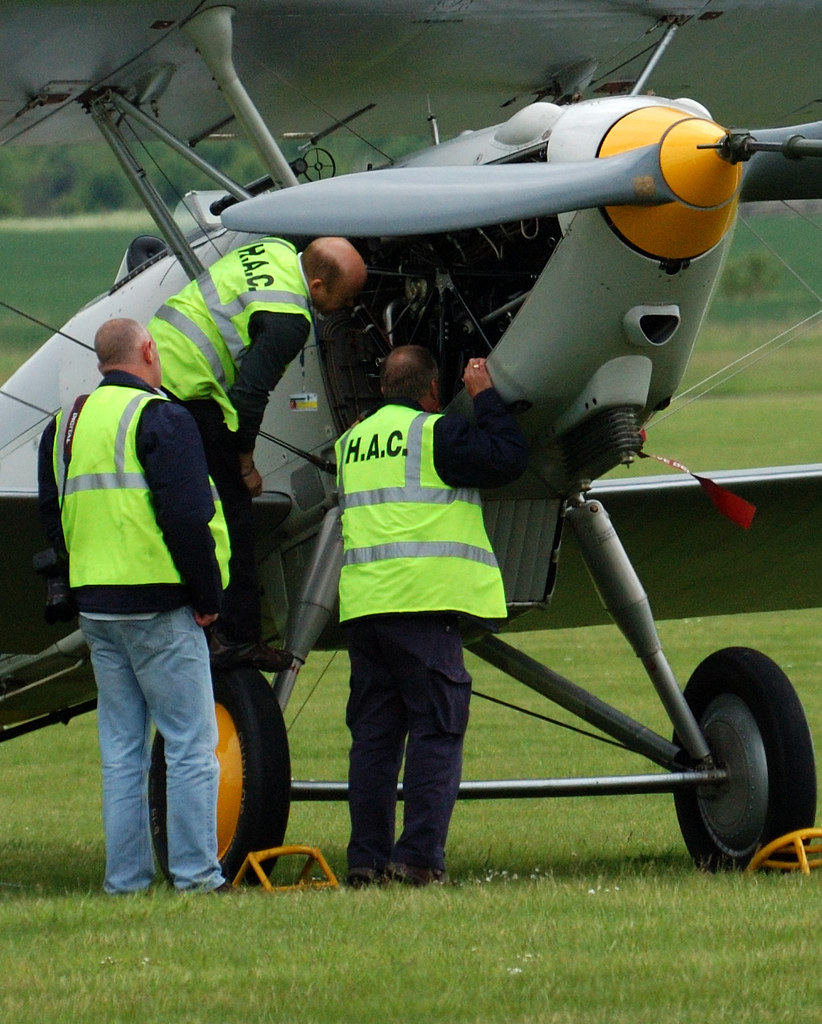
Cropping enabled me to really focus on the people in the photograph.  Area A was discarded as it was very 'busy', but did not contain enough of object in that area for the viewer to define what they were, and abstract imaging was not the aim of the image.  Area B contained a grey overcast sky that added nothing to the overall image.  Removing area C brought the crop tight into the people.

The final image is again quite different to the original and conveys the image that I had originally considered when taking the photograph.  I feel that this turns a casual photograph into something that has a more photo journalistic feel to it.  The image is now firmly about the people and what they are doing.  There are no distractions for the viewer to consider and the story conveyed is now clear.

Although there are only 3 images to show for the time spent on this exercise, it has been time well spent.  It will encourage me to think of how different the final image will be when composing a shot if I look at the picture within the picture.

Reviewing this post, I'm quite stunned at how different the cropped images are to the originals.

Saturday, 12 March 2011

Pt 1, Ex 8 Vertical and horizontal frames

Although this exercise took a considerable amount of time I found it very enjoyable as it forced me to look at all the subjects in a different way.  Previously, turning the camera round was only really something I thought about if I was taking a picture of something tall.  Whilst tall subjects often benefit from a portrait rather than landscape framing, this exercise has taught me that this is not necessarily always the case.  All the images can be viewed in this Flickr set.

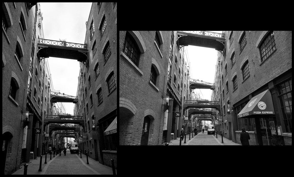
This image is of Shad Thames in London.  The portrait shot emphasises the height of the buildings.  The bridges between the old warehouses give interest to the picture where there would normally be nothing.  The landscape image emphasis the bridges linking the warehouses together.  The landscape image also give more of a sense of depth.  Personally I prefer the portrait image.  I decided to remove the colour from the image as the sky was white and black & white gives a more historical feeling.

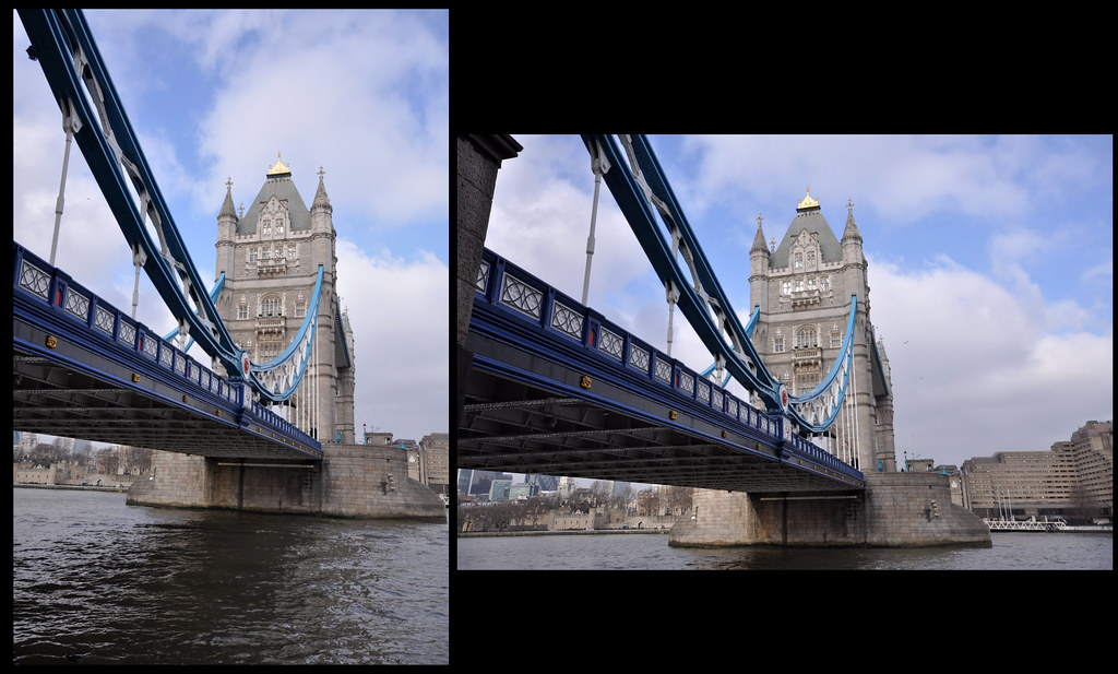
 I took these photos of Tower Bridge from the east side of the south bank.  I was surprised at the results, as although the views are essentially the same, the landscape makes the span look much longer and the portrait photos makes the tower look higher.

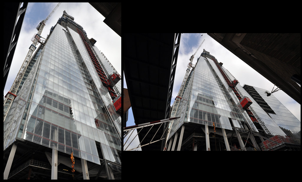
 These photos are of the 'Shard' building in the London Bridge area.  Not surprisingly, the portrait image emphasises the height of the structure being constructed.

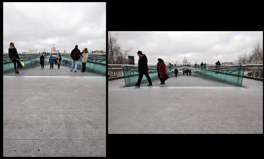
This is the Millennium Bridge looking towards St Paul's Cathedral.  The portrait images doesn't really work for me, whereas the landscape one does as it gives good lines towards the vanishing point.  Obviously a nicer sky would have made a big difference to the vibrancy of the photos!


 St Paul's Cathedral from Peter's Hill shows the iconic building in it's modern surroundings.  The portrait image makes the subject appear to be squashed into it's surroundings, whereas (surprisingly to me) the landscape photos makes it feel less crowded, even though there are more of the modern buildings in view.

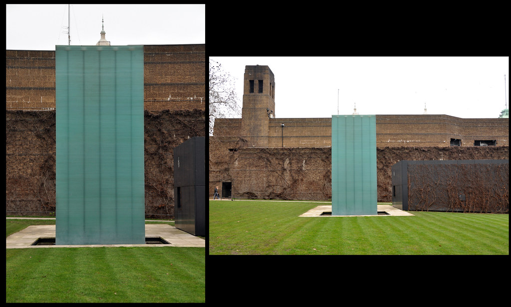
 The National Police Memorial is a simple monument which is a stack of glass rectangles.  The portrait image is fairly stark, whereas the landscape give context to the memorial surroundings - the somewhat bleak and 'cold war like' side to the Admiralty buildings

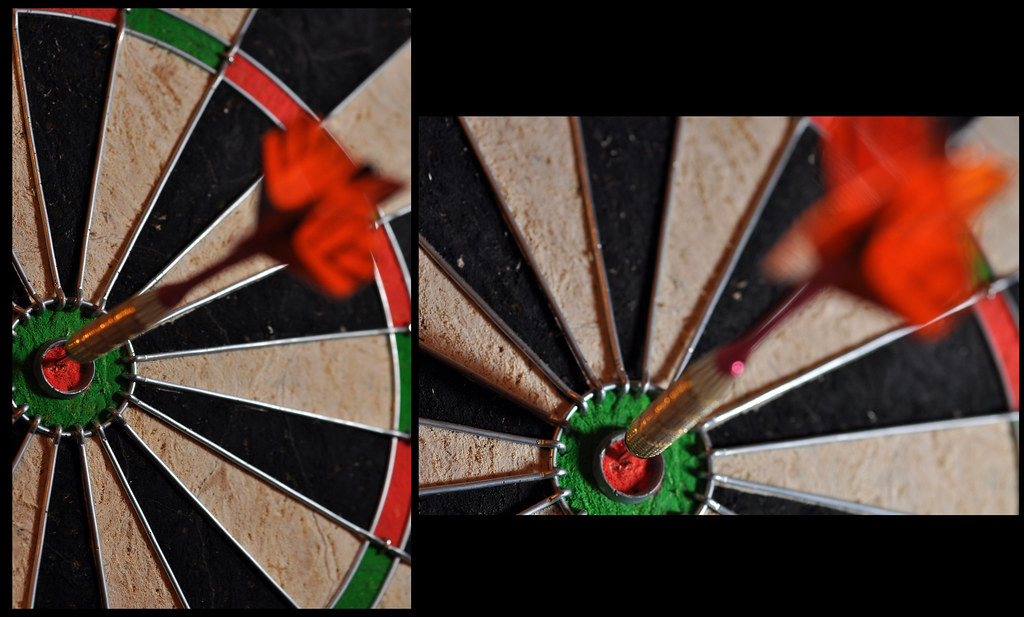
These simple photographs of a dart and dart  board give very different views of the tightly cropped dart.  I was very surprised at just how different these came out, especially that much more of the dart board is visible in the portrait image.  The flash was held off camera and to the right, slightly above centre for the portrait and slightly below centre for the landscape.  This, I felt, gave some additioanl interest to the images and worked better in the landscape version.

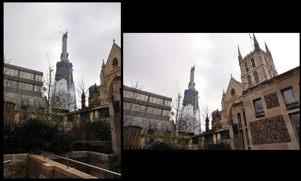
This is the Shard building under construction seen from the grounds around Southwark Cathedral.  the landscape image gives a nice contrast between old & new, although the image has become distorted from the use of a very wide lens.


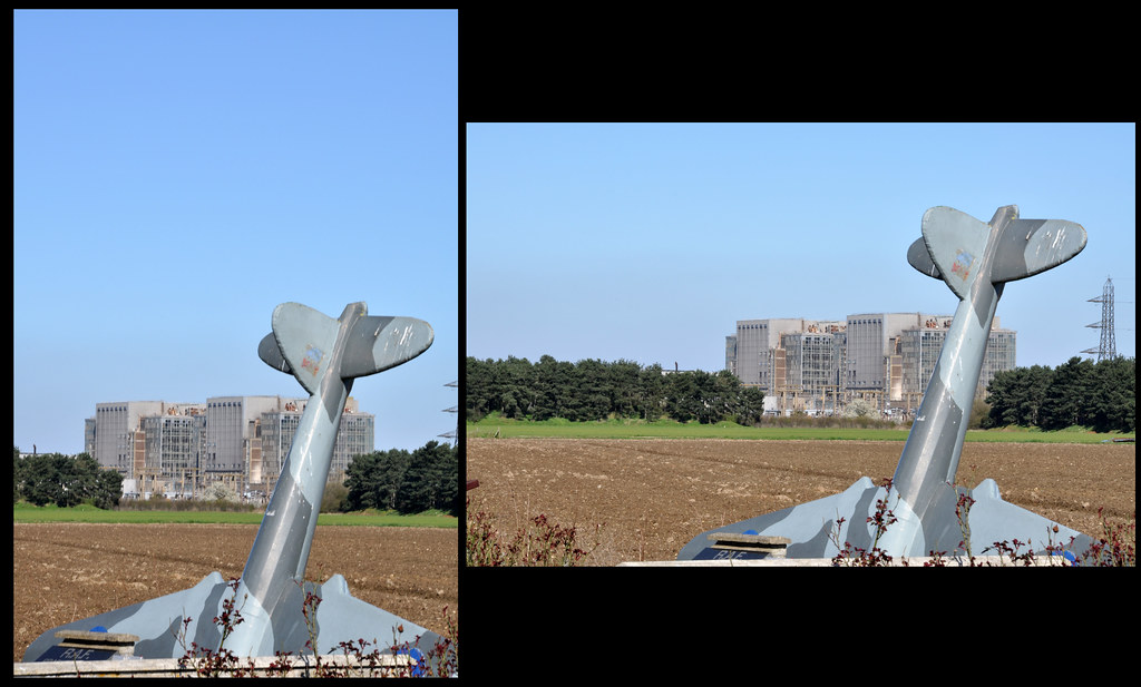
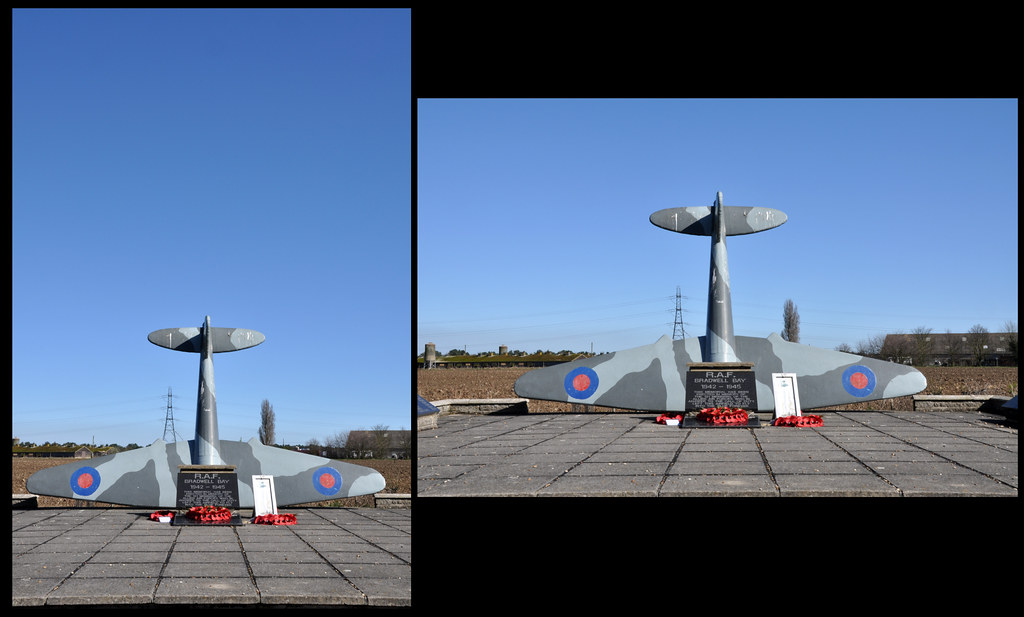
The two sets of images above are both of the memorial at the abandoned WWII airfield at Bradwell On Sea.  The first images were taken with a long lens to make the old Power Station in the background appear closer to the monument.  Of the four images, I prefer the portrait image of the memorial from straight ahead.  The lines of the paving draw the eye towards the subject and the large amount of sky ties the scene into the subject well.


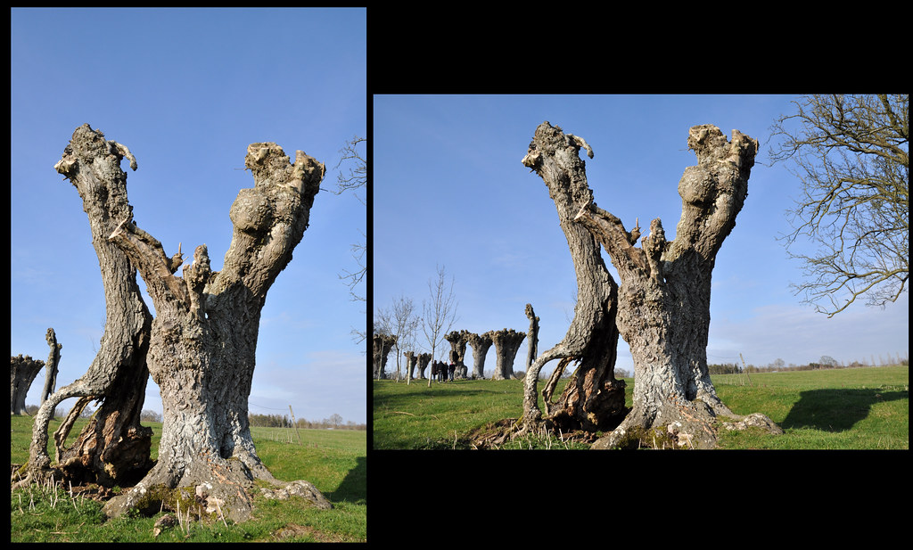
The images above are of ancient decaying Ash trees in a place know as Ash Avenue near Wilcote in Oxfordshire.  I feel that in both case, the landscape images work best as they give the viewer more information relating to the surroundings of the subjects.

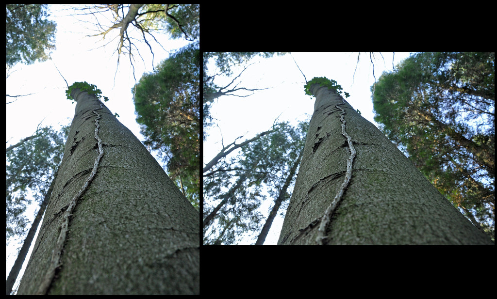
These images are of a root of ivy growing up a tree.  The landscape image doesn't really work that well for me, but the portrait one exaggerates the height of the tree well

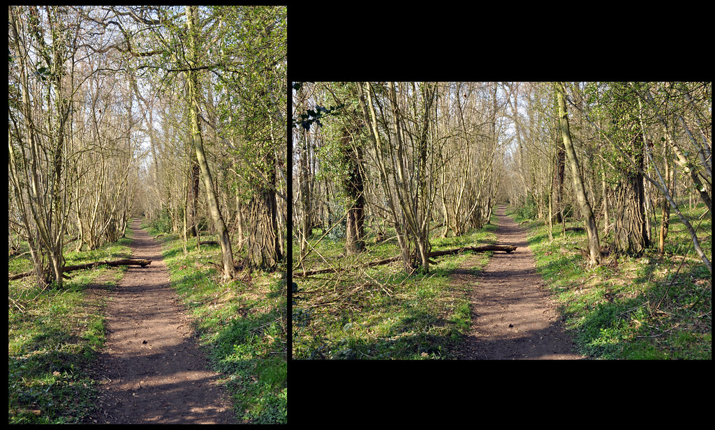
 These photographs of a woodland trail were taken as they have high objects (the trees) and a long flat subject (the path).  The landscape images seems to flatten the path whilst the portrait stretches it and it appears much longer.

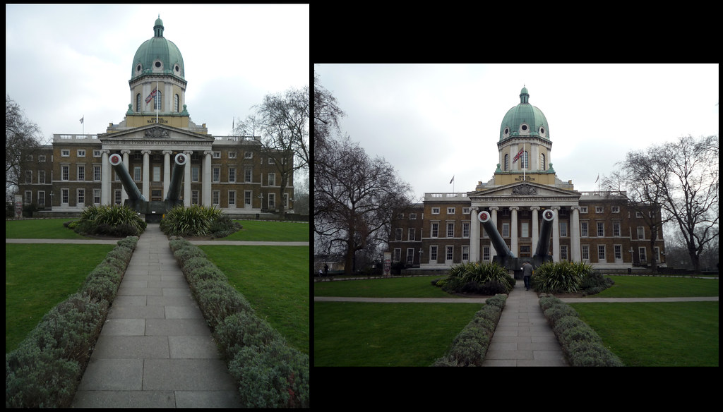
The images above are of the approach to the Imperial War Museum in London.  The portrait photograph lends itself well to the overall image as it elongates the path towards the imposing naval guns in front of the monumental like building.  Interestingly, the guns themselves are not parallel with the path, which detracts from an otherwise symmetric view.  Additionally, the small hedge bordering the path works better as it frames the path and fills the bottom of the frame.  This really helps draw the viewer into the scene.

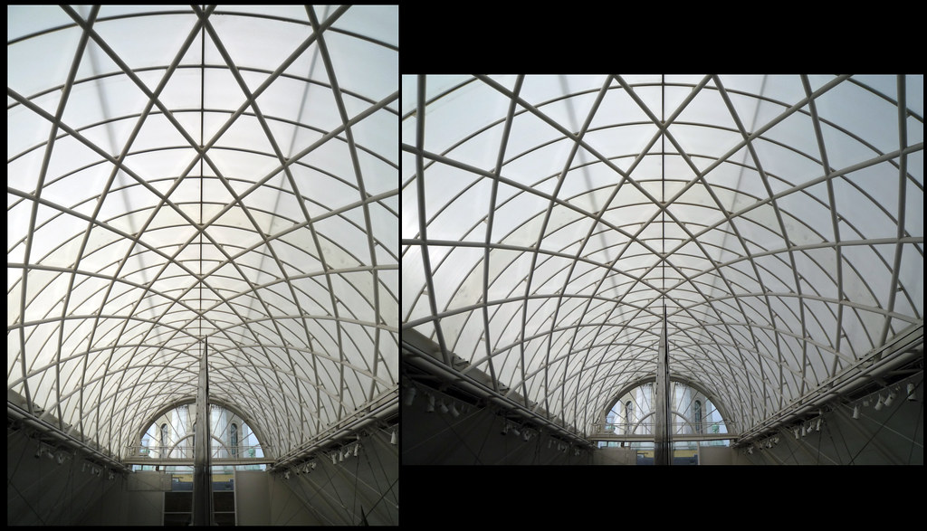
These photographs are of the roof of the exhibition hall at the Imperial War Museum.  Although both photographs were taken from exactly the same spot, the images looks quite different.  The Landscape image gives the illusion of the lattice being wider than in the portrait version, but closer inspection reveals them to be the same.  The landscape version emphasises the span, whereas the portrait image give a more 'tunnelled' feeling.


I was surprised what a big difference turning the camera round could have on fairly normal images and will be taking portrait and landscape images much more frequently now.

Pt1, Ex 7 Positioning the Horizon

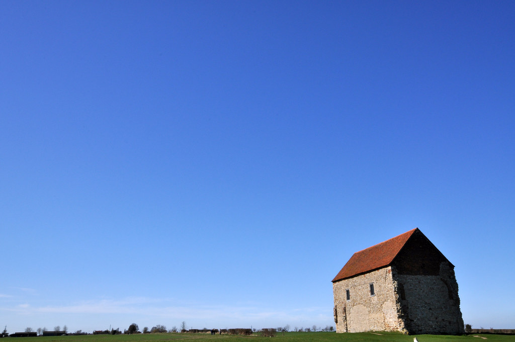
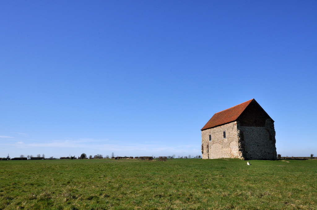
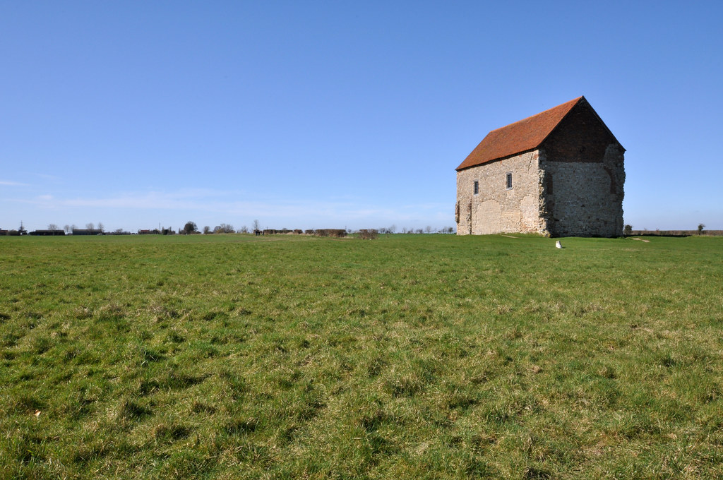
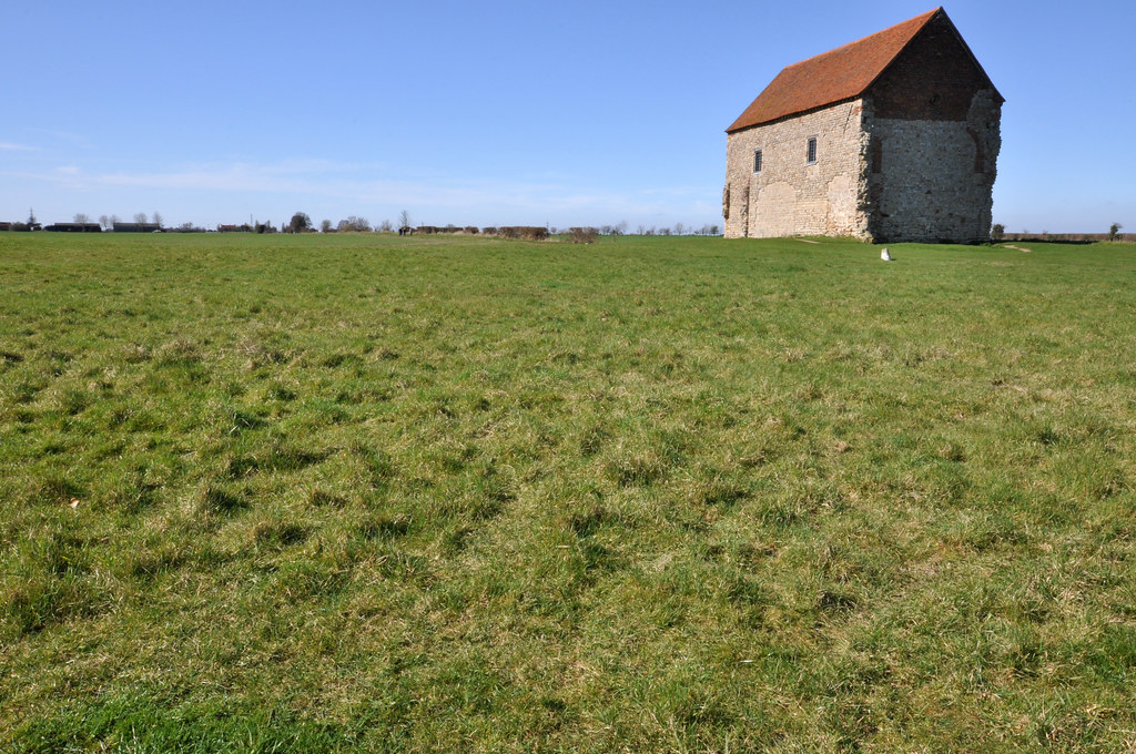
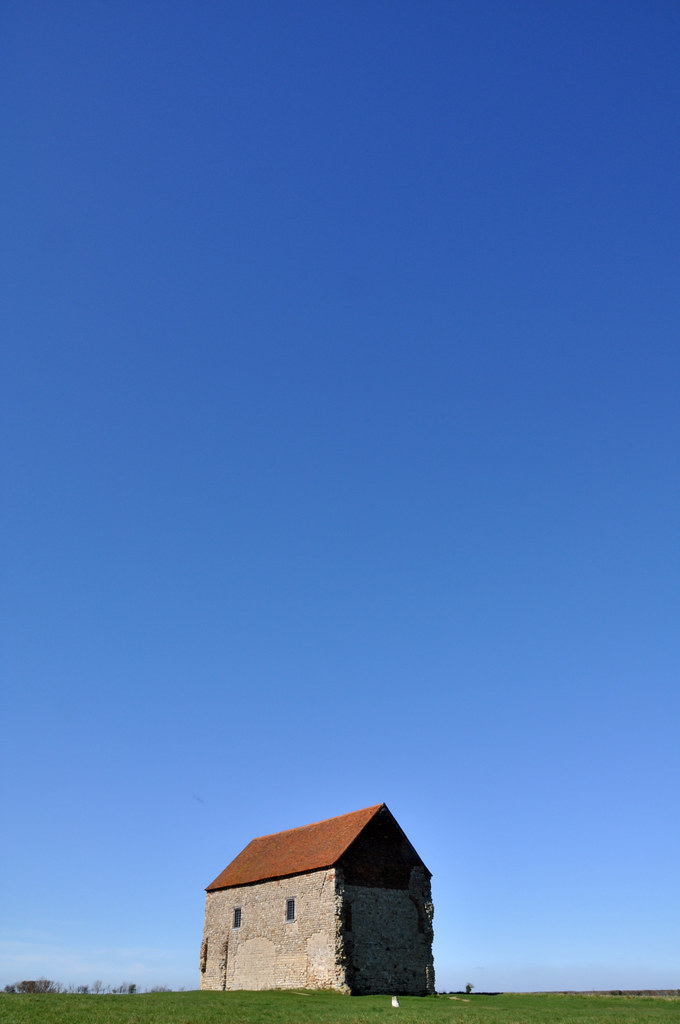
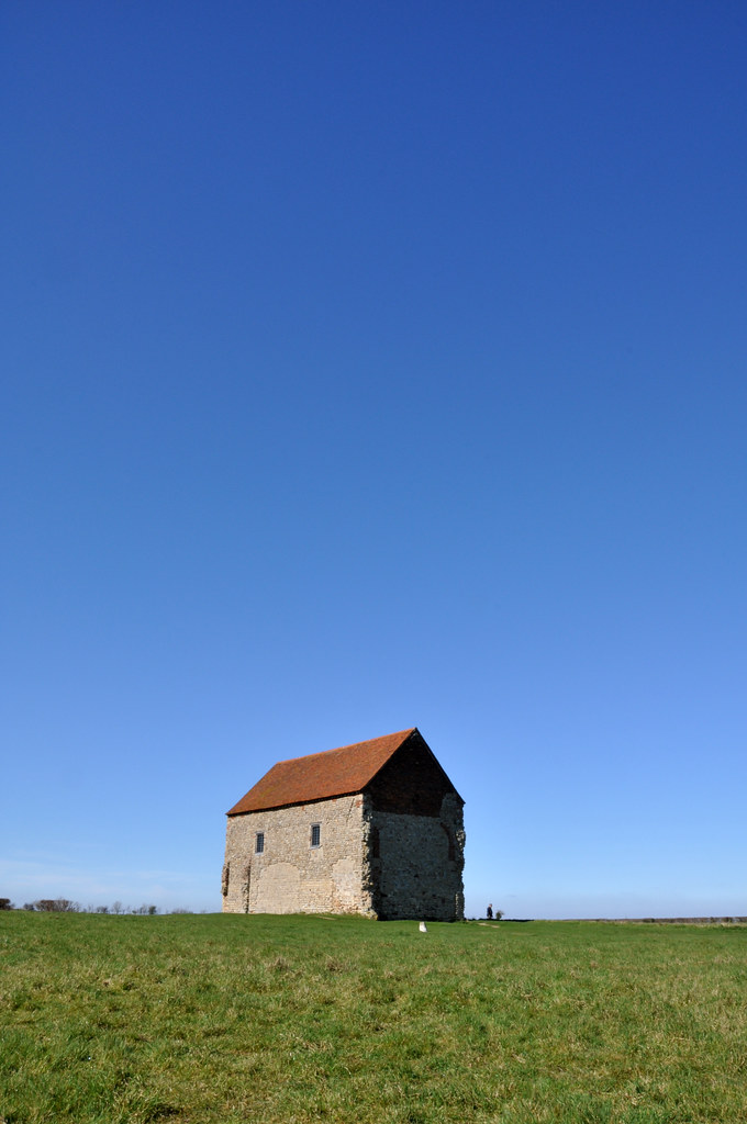
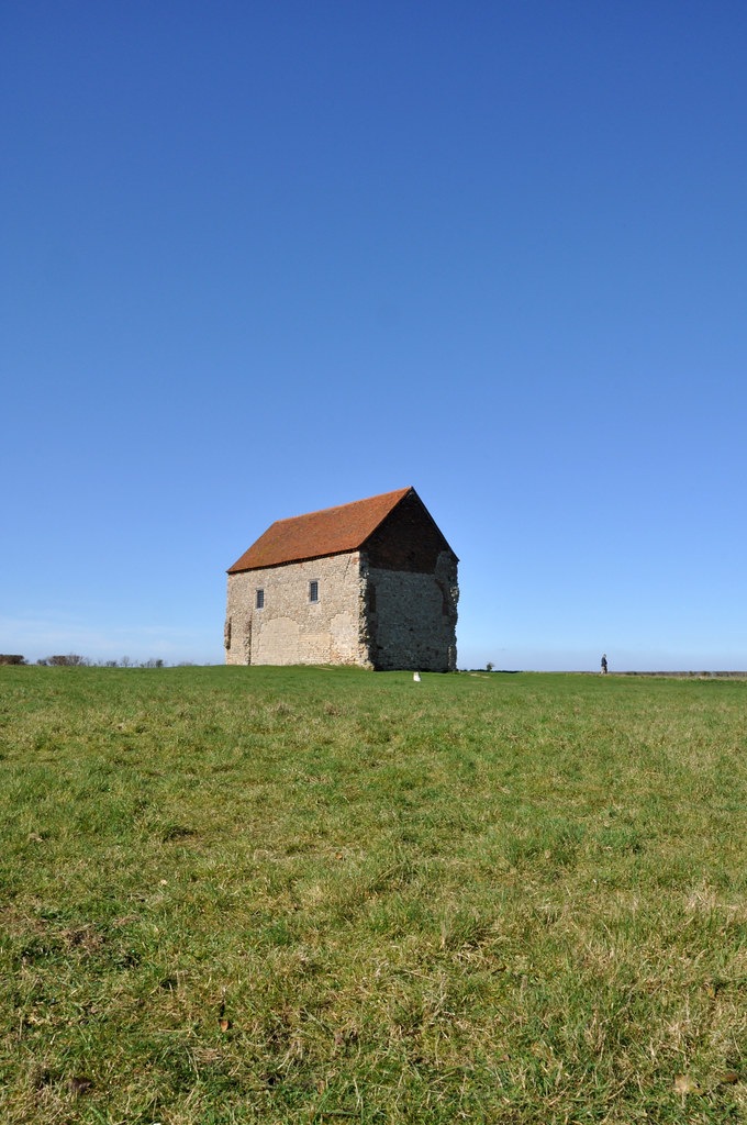
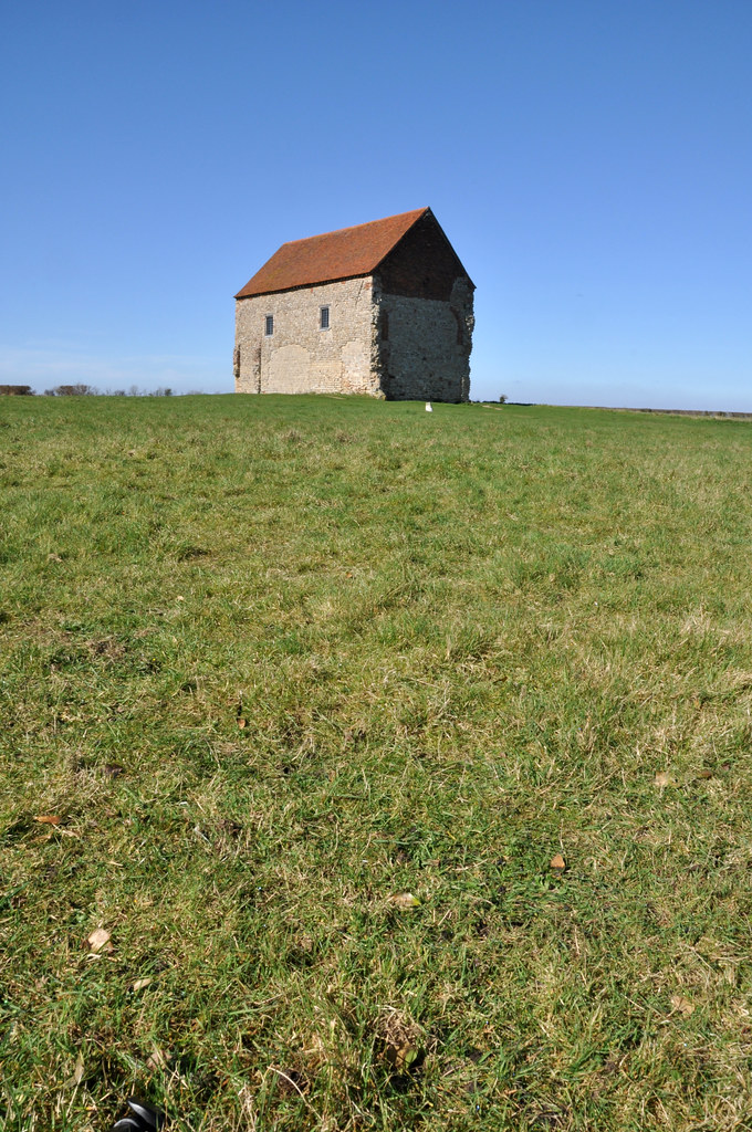
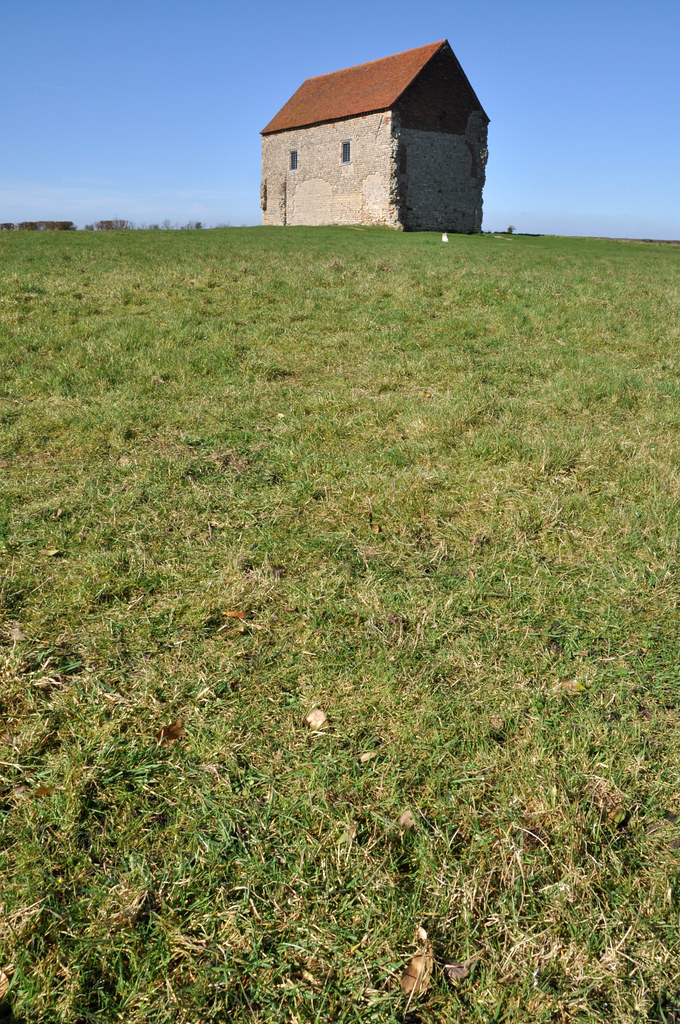
I returned to St Peter's chapel in Bradwell On Sea on a sunny day to capture the images for this exercise.  I'd wanted to use the chapel as the subject as I felt it gives a strong image as the building is substantially built, but very isolated and gives a point of interest to the horizon.  The original images can be seen in this Flickr set.

Positioning the Horizon Low.jpg  1/100, f/22, 20mm
 The dominant feature in the first image is the sky, the chapel and the horizon are very low and almost incidental elements of the overall photograph.

Positioning the Horizon Mid Low 1/100, f/22, 20mm
 The next image moves the horizon up slightly.  This creates a more balanced image, and one that is more familiar to the viewer as it becomes more akin to what one would normally view naturally.

Positioning the Horizon Mid.jpg  1/60, f/22, 20mm
As the horizon moves higher up the frame, the dominance is moved to the foreground and the viewer is drawn towards the subject

Positioning the Horizon high.jpg  1/50, f/22, 20mm
As the horizon moves higher the viewer perceives that they are getting lower in this image and there is a strong sense of being drawn into the picture towards the subject.

 I also elected to take the same scene, but with the camera turned 90 degrees. The following images are the result of this and, although the horizon is filling less of the frame, the dominance of the sky and foreground is magnified.


 Off all the images, I much prefer the ones with the subject at the bottom of the frame, largely because of the big blue sky in the images and the simple building.  Usually I prefer horizons to be high in the frame, such as in the photo below I took late in the day a few years ago.  This works as there are areas of interest in the foreground and this contrasts with the plain sky.

I feel that the the two positions of horizon that work best for me are a low one where there is a simple subject or one where you want to emphasise height and high horizons where there is an interesting subject in the foreground