Sunday, 29 January 2012

Pt 2, Exercise 6 Curves

1/800, f11, 27mm

Curves.  I took the image above when out looking for curves, of which there are certainly many in the resulting image, but the overall dominance is of complete circles, rather than curves.  I do like this photo, but as the exercise is for curves I have discounted it for the exercise.

All the photos for this exercise are in this Flickr set

The first image showing curves is of some fountains in Lincolns Inn Fields, London.
1/60, f11, 200mm
When I took the photo, the weather was poor and the raw image lacked contrast as there was quite a haze visible.  I wanted to make sure that the movement of the water was the feature of the image and ensure that the bows of the tree formed a natural frame to the water.  By enhancing the contrast and saturation as well as adjusting the curves, I believe that I have managed to do this.  The photograph as a slightly surreal, unnatural look to it, but the curves made by the water are strong, so the image works.

The next photograph is of a seeming abandoned boat on the mud at Maldon in Essex.
1/125, f20, 95mm
The original image had more of the foreground in view and some other channels formed in the mud by the water.  I made various crops, settling on this as the final version.  The large 'S' formed in the mud draws the eye along it towards the old decaying boat, and indeed back from the boat as well.  Black and White lends itself well to this picture adding to the sense of decay.

10 secs, f22, 14mm
This is a long exposure of a dual carriageway at night.  Although the majority of the lines painted by the passing traffic is straight, the eye is drawn to the curve and this forms the focal point of the image.  The static orange lights also help draw the eye to the curve as well.  The image gives the sense of movement, almost of water flowing, even though there is nothing in the picture that can be seen to be moving.

The fourth image is of the roof at the British Museum.  A very impressive construction, made of nothing but straight lines, but, viewed with a wide lens, projects a very pronounced curve.
1/500, f18, 18mm
The eye is drawn in towards the tightening curve, which radiates out to dominate the picture.  The curved wall on the right of the picture reinforces this, providing a graceful lead into the tightening focal point where all the lines of the roof appear to converge.

Pt 2, Exercise 5 Diagonals

Diagonal Lines.  That's anything that isn't curved, vertical or horizontal and off I went searching for them.  I quickly found myself drawn towards architecture.  Selected images from my shooting are in this Flickr set.

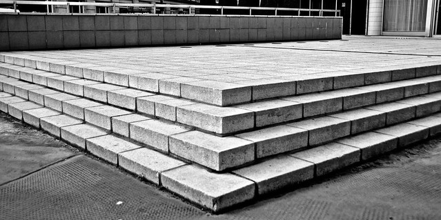
First up is a photo of some steps which form a right angle

1/320, f3.8, 24mm
This image has strong diagonals, formed by the sharp edges of the steps.  Using Black & White and boosting the contrast a bit accentuates the shadows and hence lines that form the diagonals.


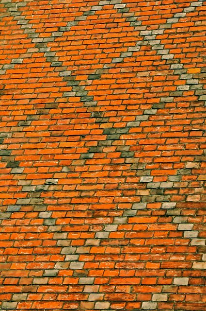
The next image shows the pattern in the brickwork at Lincons Inn Fields in London

1/40, f25, 80mm
The bricks have been laid to form a pattern of diagonals, which dominate this picture.  Interestingly, the red bricks, although horizontal at the bottom of the image, have diagonal sides due to the angle from which the photo was taken.  This in turn makes the entire picture seem as if it is full of diagonals, even though the horizontal lines are mostly parallel with the bottom of the frame.

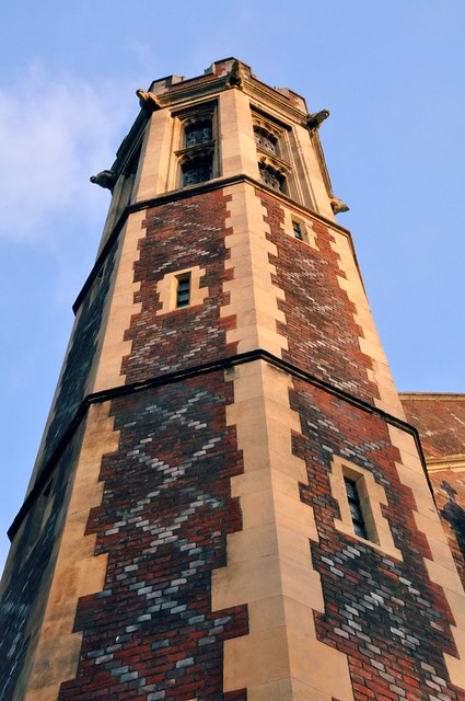
The third photo is of a wider shot of the image above and shows one of the towers and Lincolns Inn Fields.

1/40, f29, 40mm
Whilst the brick work pattern is still visible, the picture is dominated by the strong diagonals of the octagonal tower and these draw the viewers eyes from the bottom to the top of the image, almost through the top of the tower into the sky beyond.

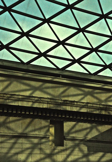
The fourth photograph depicts the roof of the British Museum.  This is a geodesic construction, formed of triangular elements, each one providing three diagonal lines.

1/640, f18, 48mm
The angle at which the photo was taken ensured that the wall was also at a diagonal to the frame.  The shadow created by the roof provided continuation of the diagonals throughout the frame and this tends to draw the eye from top right to bottom left when viewing.

Monday, 17 October 2011

Pt 2, Exercise 4 Horizontal and Vertical Lines

This would be easy, or so I thought.  There are many lines around us, so getting 4 images of horizontal and vertical lines would be no trouble at all, but then I started thinking.  I wanted interesting, different & unusual things in my pictures.  Suddenly things got more difficult.

As usual, all the images can be seen full size of Flickr, in this set.

Anyway, I shall start with some of the things that didn't work.

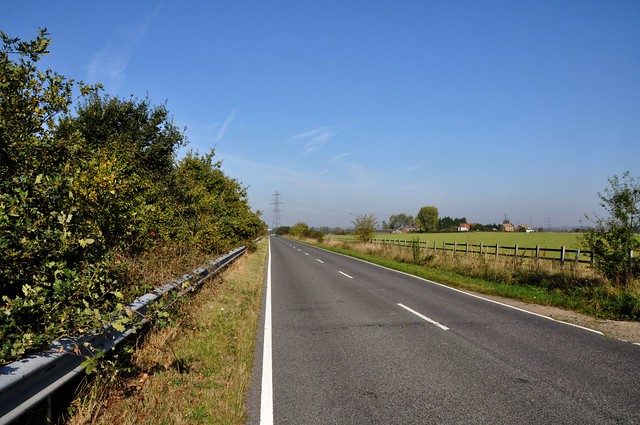
This Photo certainly has lines in it, but are they horizontal or vertical?  Well, they are kind of both, it's a very recognisable scene and one that we know has horizontal lines, but they are not horizontal here.  There are vertical and diagonal lines here, and I don't think it works anyway.  There isn't really a point of interest.

I had high hopes for this next photograph.  It's an extreme macro shot of a record.  It's extreme because I used a 50mm Macro lens and 3 extension tubes to really get in close to the grooves.  The result is certainly different, and when viewed full size, certainly has some interesting effects, but the dominant effect is not of the horizontal lines.  There's not quite enough detail for that.

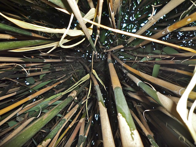
This is a photo taken in the middle of a large clump of Bamboo growing in a local wood.  I dare say it's quite unusual to find Bamboo growing in the wild in the UK, so thinking of vertical lines, I thrust the camera into the middle of the bamboo and took some shots.  It's certainly a bit different, but lacks something.  There isn't really a focal point that the viewer is drawn to.  Another one that didn't quite work.

So, onto the pictures that I was happier with.

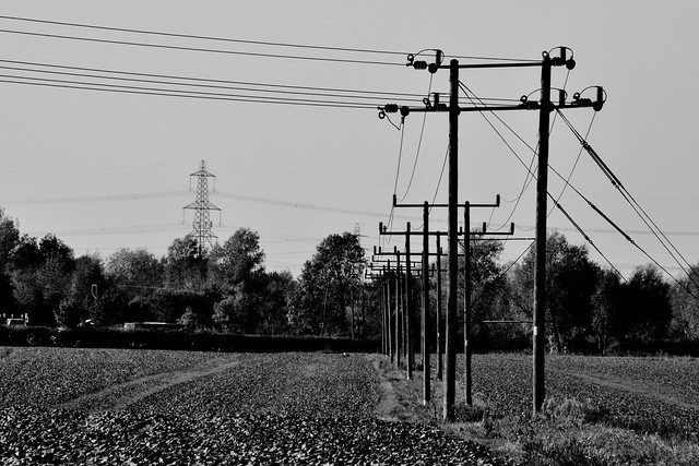
Vertical Lines 1, 1/125, 200mm, f/22
Vertical lines 1 shows a row of double poles supporting power lines.  The relatively long lens shortens the distance from the nearest to the furthest poles and makes for quite a striking feature.  I elected to use Black and White and push the contrast a bit to make the poles stand out more against a fairly cluttered background.  The vertical lines are the dominant feature ad draw the viewer from near to far.

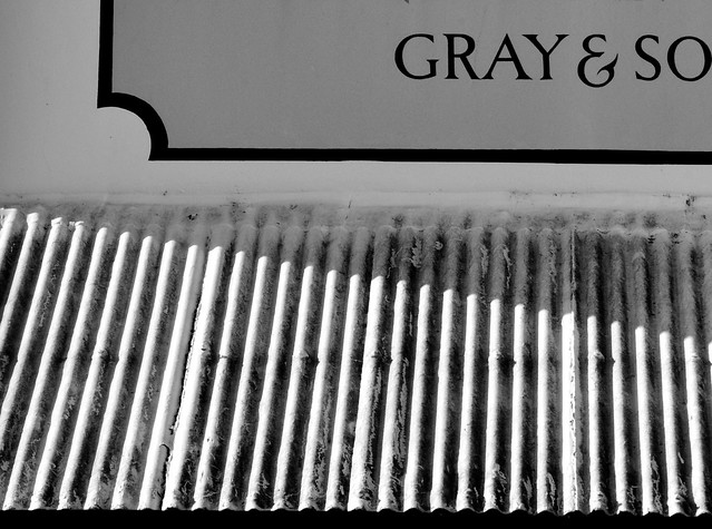
Vertical Lines 2, 1/125, 80mm, f/22

Vertical Lines 2 depicts a corrugated roof on the side of a public house.  The original image features more of the painted sign and some clutter from a nearby road sign, so I cropped fairly tightly on the corrugation and used Black and White again.  The strong shadows and dirt really bring out the vertical lines strongly and become dominant.  There is enough of the painted sign on the wall to give some additional interest, but the photograph real is mainly about the lines the roof make.

Vertical Lines 3, 1/30, 50mm (+ extension tubes), f/22
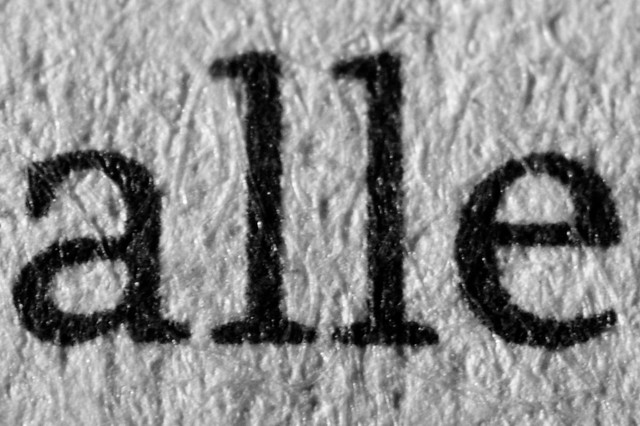
Vertical Lines 3 is another Black and White image, but this time so was the subject - a newspaper.  The extremely close shot shows the detail of the fibres in the paper and upon it, the clearly defined ink.  The two L's provide the dominance and vertical lines.  There is a tension in the image as we don't know what it's from.  I deliberately cropped so that only two more letters are visible and give no real clue as to their context.  the viewer is left wondering what the word is.  The texture of the paper also adds to an air of wonder as it's not really that evident what we are looking at.

50mm, 1/500 f/9
Vertical Lines 4 depicts an apple tree seen through a garden chair.  The vertical lines are strong and dominate the image.  The grain of the wood adds texture to the image, providing more interest.  The image was tweaked in Aperture through curve adjustments.


Horizontal Lines 1, 1/60, 500mm, f/22

Horizontal Lines 1 is a common sight, but one that is fleeting and transient in nature.  Using a very long lens, I captured a passing aircraft and the contrails it left behind.  The image was cropped to accentuate the horizontal contrails and I made some slight adjustment to the curves to deepen the sky and bring out the white vapour.  The image was tricky to capture as the aircraft was a very long way away and moved through the viewfinder at a very rapid rate.  I'm happy with the result though.  the horizontal lines are dominant and the eye is drawn right to the source of the lines.

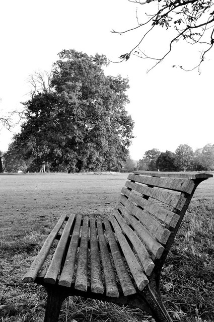
Horizontal Lines 2, 1/25, 32mm, f/22
I wasn't sure about Horizontal Lines 2 as it has a lot of lines in it, but it does give a strong impression of horizontal.  The top of the bench lines up with the horizon reinforcing the point.  The remainder of the bench does curve round into the vertical, but somehow they all come across as horizontal to me looking at the image.  Again, black and white seemed to suit this best, partly due to the lack of contrast in the colour image.  Curves were tweaked to emphasise the dark edges to the lines.

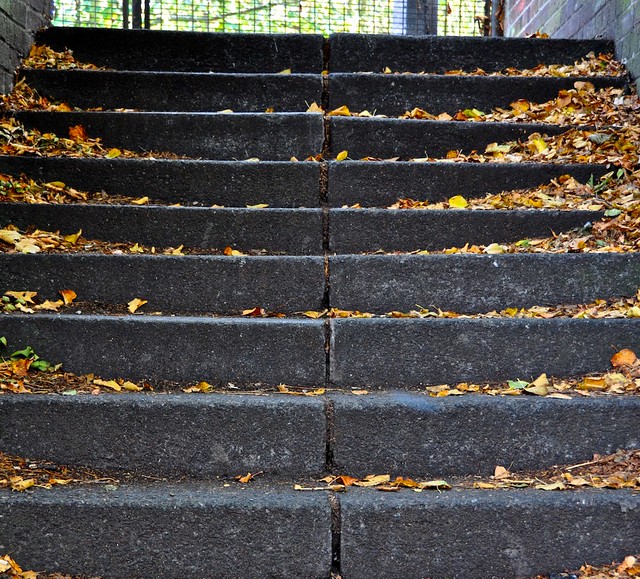
34mm, 1/40, f/4.2

Horizontal Lines 3 is of some old carved stone steps next to a railway.  The treads of the steps provide the primary focus of the image and hence, horizontal lines are dominant.  The leaves add colour and the vertical gap between the steps adds a contrasting vertical line, however this does not detract from the dominance of the horizontal lines.

55mm, 1/250, f/8
Horizontal Lines 4 - is a common site, yellow lines on a road.  The tight framing creates an abstract image, which is clearly all about the horizontal lines.  I purposely chose a worn road so the there would be plenty of texture to enhance the image.  The relatively low autumn sun creates strong shadows in the surface of the road adding contrast to what could easily have been a very grey looking picture.  Adjustments were made to the image to bring out the contrast a little more.

Friday, 14 October 2011

The Moon Tonight

The moon was quite striking tonight, so a chance for some quick shots to be taken before it dissapeared behind the clouds that are sure to come.

I haven't altered the image except for a crop, it really was this colour!

1/200, 500mm, f6.3
 Original image can be seen on my Flickr pages

Sunday, 9 October 2011

Pt 2, Exercise 3 Multiple Points

"With several points the relationships are not so predictable." Says the exercise.

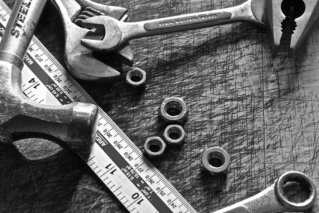
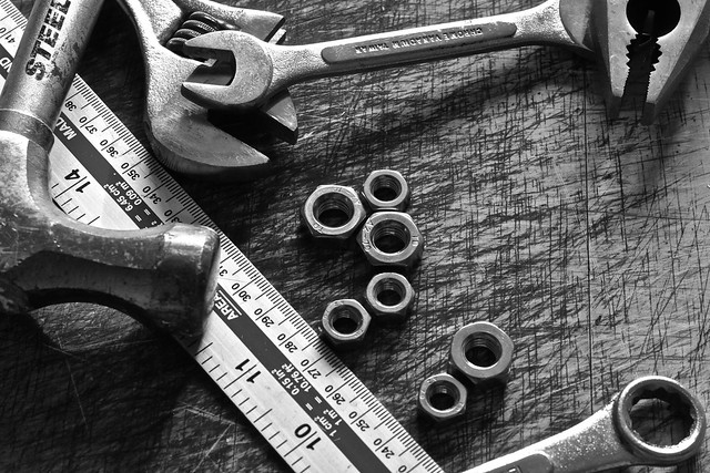
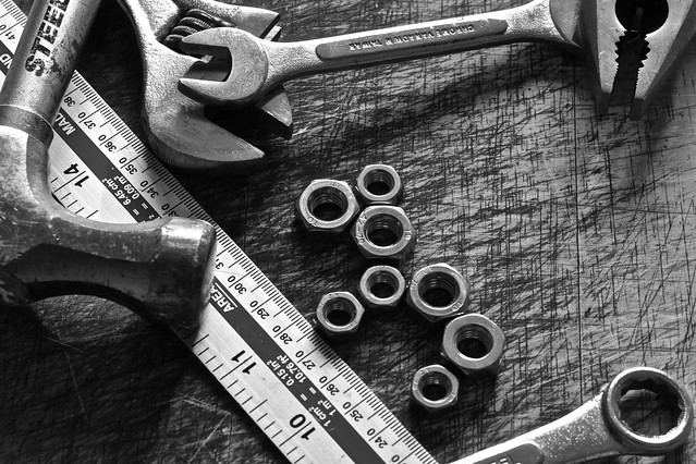
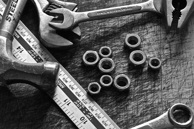
Well, it wasn't kidding, it took me a while to get my head round this, but once I'd worked out what I think is needed, I started to think about subjects.  I didn't want to do rocks & pebbles as that's in the course notes, and decided I wanted to do something more industrial, with hard metal surfaces.  I reasoned that these would work well in black and white.  Some rooting around in the garage saw me return with a handful of objects to build a scene with which to site my points, which are a collection of steel nuts.

Multiple Points 1, 50mm, 1/160, f6.3
The first image has a nut placed next to the ruler.  Positioning the nut in the open space looked odd to me and deliberately positioned, but in a haphazard way.

Multiple Points 2, 50mm, 1/160, f6.3
Multiple Points 2 adds another nut near to the adjustable spanner.  There is a clear line between the two and the eye is drawn from the lower to the higher point.  The proximity of the jaws of the adjustable spanner add some context to the positioning.

Multiple Points 3, 50mm, 1/160, f6.3
The addition of a larger 3rd point gives the image a definate shape, one that reminds me of a reclined car seat.

Multiple Points 4, 50mm, 1/160, f6.3
The fourth point adds some balance.  The shape is similar to a see-saw and the larger nut is closer to the centre than the small nut, giving the impression of equilibrium.

Multiple Points 5, 50mm, 1/160, f6.3
The 5th point makes a trio of points, which has now become dominant, with two incidental satellite points either side.

Multiple Points 6, 50mm, 1/160, f6.3
Another point has introduced a distinct curve.  There is a suggestion of order, but the overall arrangement is still abstract, but the curve is pleasing to the eye

Multiple Points 7, 50mm, 1/160, f6.3
Another point and a slight rearrangement gives the points a new relationship.  The two groups are seemingly interacting, despite being unbalanced.

Multiple Points 8, 50mm, 1/160, f6.3
The addition of an 8th point, linking the two groups together had a dramatic effect.  The points now look like a horse or a camel!  This was not intentional, but I decided to shoot it and add it to the sequence to show how much an image could change with just a single small change.  The addition of this point has left a somewhat comedic image, time to make a change!

Multiple Points 9, 50mm, 1/160, f6.3
The final arrangement has two clusters of points.  The image has a symmetry, and it looks like the smaller cluster has detached from the main cluster.  The gap between the clusters adds interest and draws the eye down and to the right.  The red lines in the picture below, show the symmetrical relationship between the two clusters.  The green lines show how lines are converged on the mid point of the smaller cluster which draws the eye.


There are two shapes formed in the final arrangement as shown below.  These are complementary and space between them ties them together as well.  Although the shapes are clearly quite different, there is a degree of symmetry as well.

Pt 2, Exercise 2, The Relationship Between Points

Work in progress - to be completed

Sunday, 2 October 2011

Pt 2, Exercise 1, Positioning Points

Points.  I have to admit, I found the text in the course notes somewhat confusing at first and images of multiple points in the middle of text about single points was a bit puzzling!

Anyway, The first subject is a football on grass with a reasonably long shadow.  I reasoned that the shadow was going to be a key element in this photo and it's length and direction in relation to the photo as a whole would dramatically change the feel of the image.


Above are 8 of the photos I took, each with a different position in the frame and/or angle.  All of the images, although showing a static ball on grass give a suggestion of movement due to the long shadow.  I don't feel the images where the ball is positioned near the top of the frame work as it gives the impression that the ball is floating and just looks, in my eyes, wrong.  This is also true where the subject is mid frame as well.  Where the ball is towards the bottom of the frame, there is more belief in the reality of the scene as it seems more 'traditional'.  Of the three images with the ball in the lower part of the frame, the one with the shadow pointing towards the viewer is the least effective.  The one that works best for me is the one where there the edge of the lawn is visible in the top right of the frame.  This lends some symmetry to the image and enables the viewer to interpret the scene more than the others.

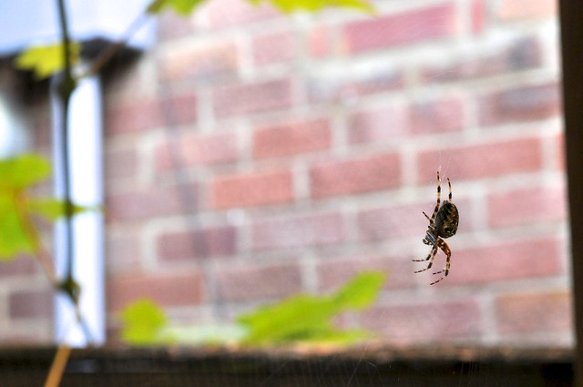
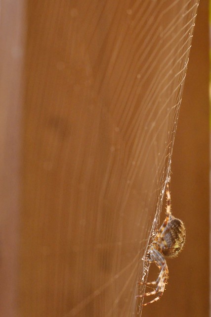
The next subjects are spiders.  They seem to have exploded in numbers this year and there are lots of Common Orb spiders in the garden.

1/80, 50mm, f10
The first image Urban Spider 1, shows the subject in the lower right of the frame.  A moderately wide aperture has blurred the background, but left enough detail, though indistinct, for the viewer to interpret the wider scene.  The subject is clearly the spider as it stand out well from the background, even though it is reasonably small in the frame.  I was careful to make sure that the web is just visible, giving more depth to the image and provides extra references to draw the viewer into the subject.  The drainpipe in the background, whilst would normally be a distraction, I feel adds to this picture as it changes a plain wall into a more domestic setting.  The point that the spider makes works well in this picture, the eye is drawn to the spider and the the rest of the picture appears to fade out.


The next two pictures are of another spider, again on a web, but this time captured with a portrait orientation.

1/25, f10, 50mm

1/25, f10, 50mm
Both of the images can be seen in this Flickr set.
The images are both very similar, and there is little to choose between them.  Both draw the viewers eye in well via the web leading the eye towards the spider.  The picture with the spider lower in the frame is the one I prefer, but this is more to do with the pattern of the web and the background than the placement of the point.  With this in mind, I cropped the image to remove the background distractions.

The cropped image works well.  The spider is the only focal point and the structure of the web accentuates this.  The image looks right as well, with the spider low down and on the underside of the web.  Whilst researching the spiders that I photographed, I found out that spiders always use the underside of a web, which is why this image works - it looks right, because it is right.  When I experimented with rotating the image, it just looked wrong.
The lower right positioning adds to the feeling of suspension.

Sunday, 22 May 2011

Pt1, Assignment - Contrasts

I found this assignment quite tricky to complete, partly because it took much longer than I anticipated and partly because I approached it think it 'wouldn't be too difficult'.  In the process of completing the assignment I took over 200 photos, many of which were somewhat experimental.  Some worked, some didn't, but all taught me something.

All the images for this assignment can be seen full size in this set on Flickr

High / Low
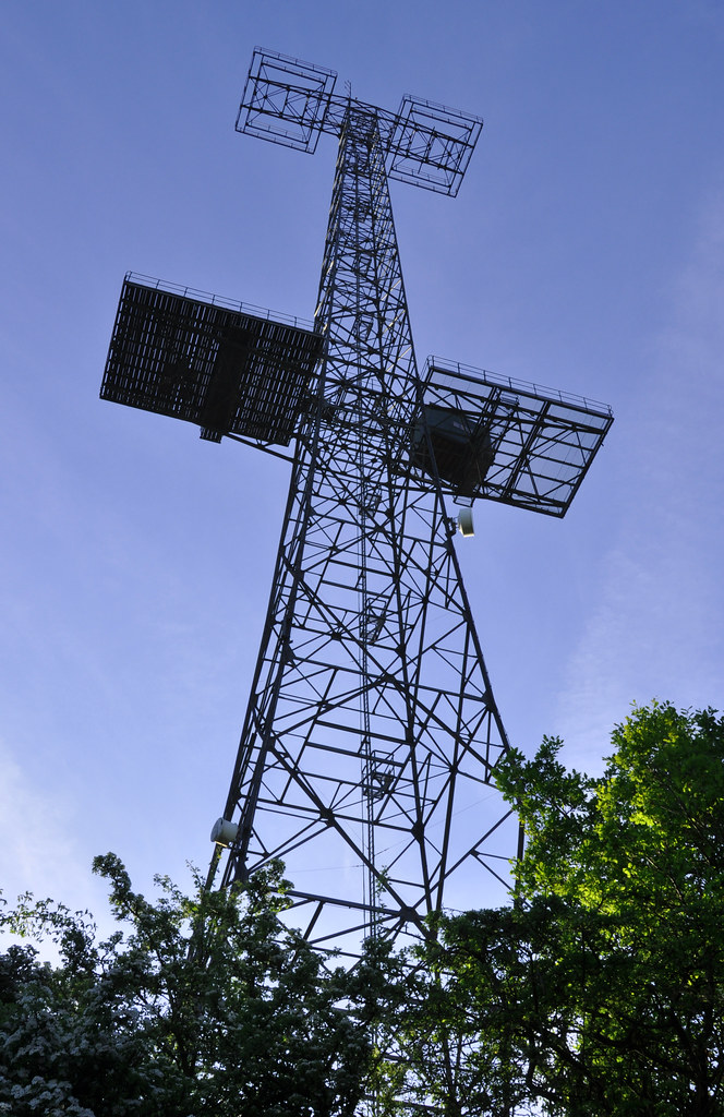
High/Low High, f/16, 1/80, 24mm
The high image is of a historic radar tower that was originally erected during the 2nd World War are formed part of the 'Home Chain' radar defences.  This photos was taken early in the day so that the sun was low and it lit the scene from a low angle.  This emphasised the height of the subject by illuminating the lower parts, especially the trees to the right.  The gentle sweep of the structure skywards emphasised the height too.

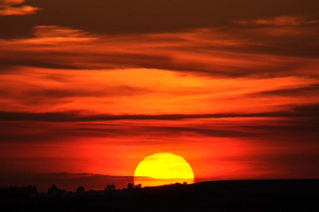
High/Low Low, f/13, 1/640, 500mm
For the contrasting low photograph, I've used this picture of the sun setting, viewed from Whitstable which I took on a holiday there.  A very long lens was used to give the sun a larger presence in the frame and the black ground at the bottom of the picture gives a good reference to the lowness of the sun in the sky.


Hard / Soft
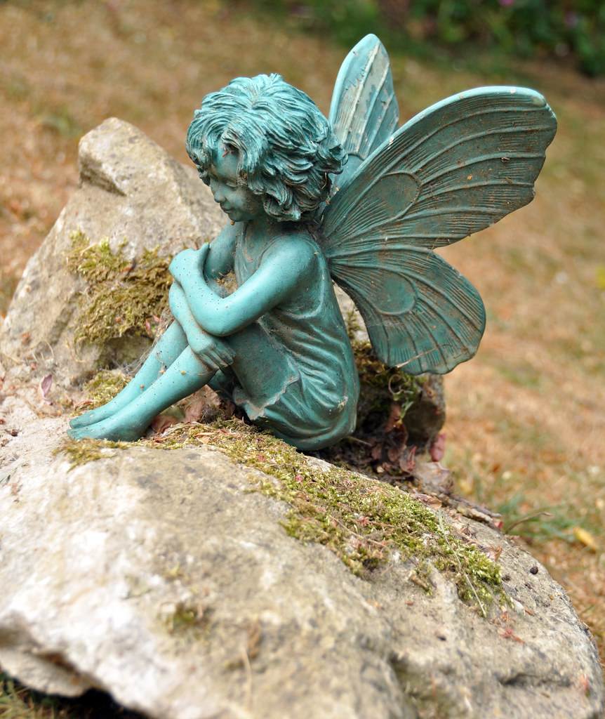
Hard/Soft Hard, f/4.5, 1/320, 44mm
The Hard image shows a garden ornament sitting on a rock.  The hardness of the rock is clear to see and the fairy also is clearly a hard object .  This is evident by the distinct edges and deep shadowing that show up the detail of the subject.  From this we can clearly see that the object to not soft in any way.

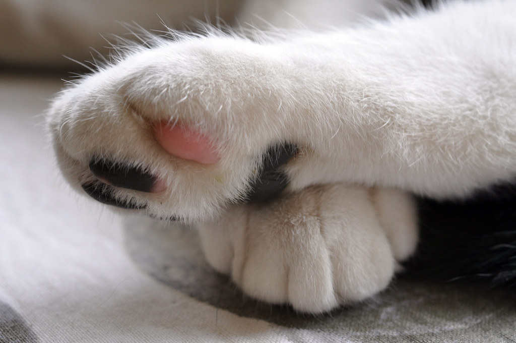
Hard/Soft Soft, f/8, 1/50, 50mm
The soft image is of our cat's paws.  I took this with a macro lens so that I could emphasise the detail of the fur.  This together with the pink pad on the bottom of the paw really convey the softness of the subject.  As you can imagine, an animal will not pose for a photo, so many pictures were taken.  I chose this one as there was plenty of detail that brought out the softness of the subject and because the paws being crossed made for a much more interesting photograph.


Many / Few
Many/Few Many, f/16, 1/60, 50mm
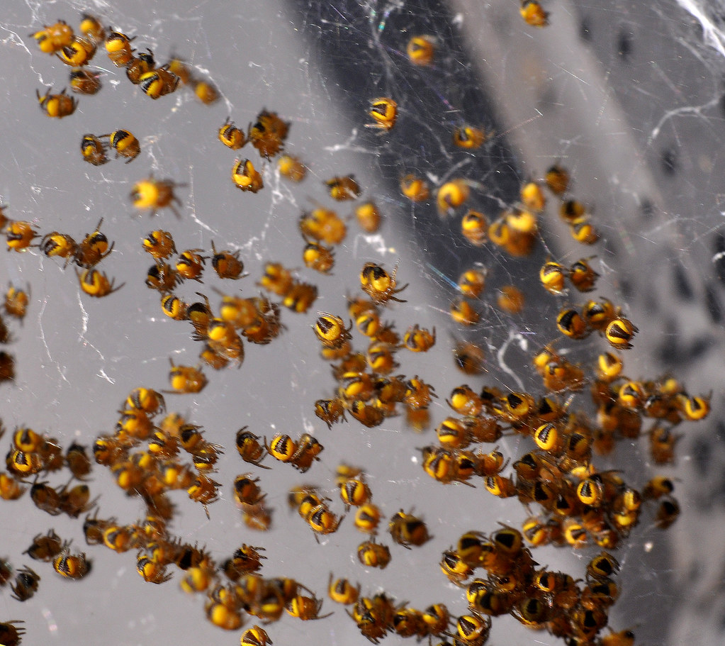
The photo I took to represent many is of a cluster of recent hatched spiders that I found on our wheelie bin.  A macro lens was used to get a close shot of the spiders, but as a consequence there is little depth.  The image certainly conveys the theme of 'many' and I believe it is interesting as a casual glance would leave the viewer intrigued as to what the subject was.

Many/Few Few, f/4.5, 1/320, 44mm
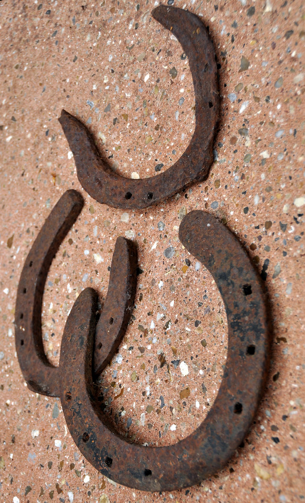
For the contrasting 'few' image, I've used 3 old horse shoes.  By turning the camera round and shooting from an unconventional angle, the horseshoes almost appear to be defying gravity.  I also physically separated the most decayed shoe, whilst deliberately connected the others.  This suggests a connection between the joined items and isolation of the third


Liquid / Solid
Liquid/Solid Liquid, f/5, 1/320, 75mm
This liquid shot shows water falling in front of a Magnolia.  To capture the image I pre focused in front of the background at the spot where I was going to pour the water.  To get a 'sheet' of falling water, I used a rectangular container and tipped the water out carefully.  The resultant image captures the fluidity of the water as it falls.

Liquid/Solid Solid, f/10, 1/125, 200mm
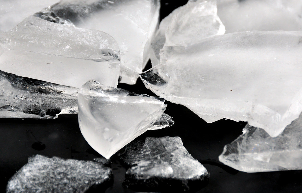
For the contrasting Solid, I froze some water, then smashed it to create chunks to photograph.  The sharp edges of the ice clearly demonstrate that it is a solid and as it is clearly frozen water, contrasts well with the very fluid liquid image.

Black /White
Black/White Black, f3.2, 1/50, 50mm
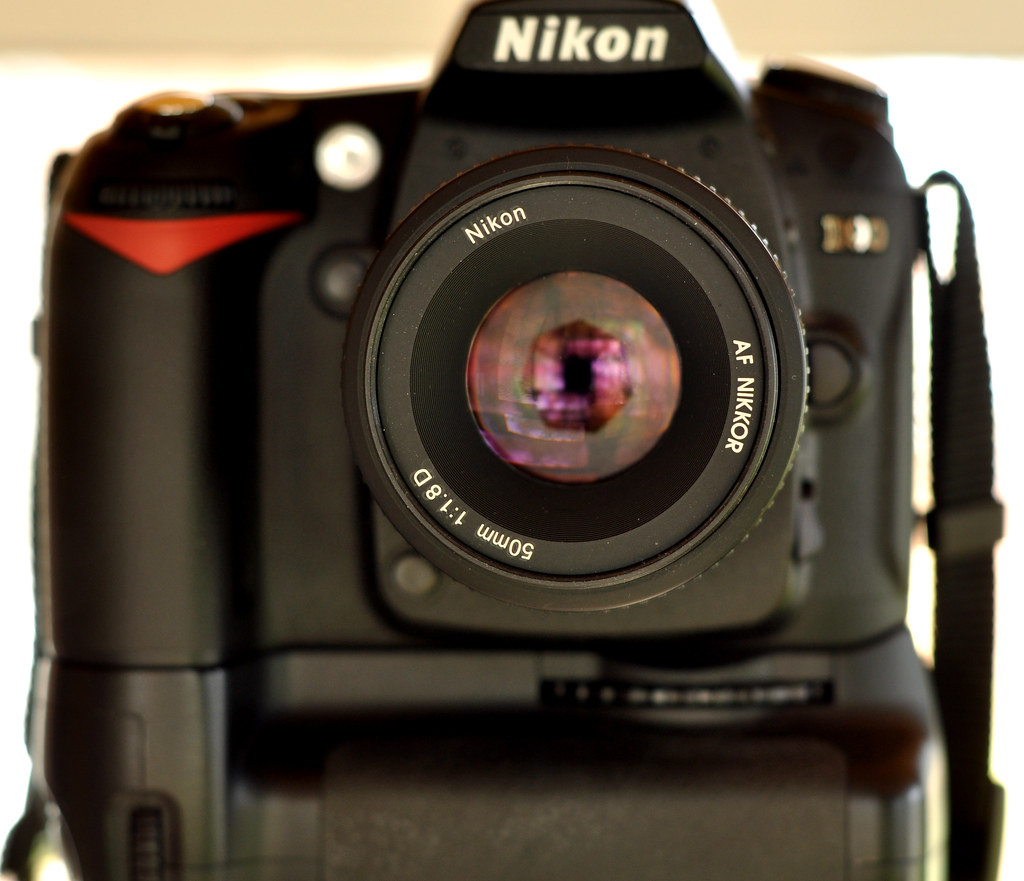
After quite a lot of searching, I used what was right in front of me for the Black image - my camera.  I set this up on a tripod in front of a mirror an manually focused on the tip of the lens I was using.  The timer setting was used to take the photo so that no fingers would detract from the blackness of the camera.  The bright border emphasises the black too.  The image was also reversed in Photoshop so that the lettering is the correct way round for the viewer.

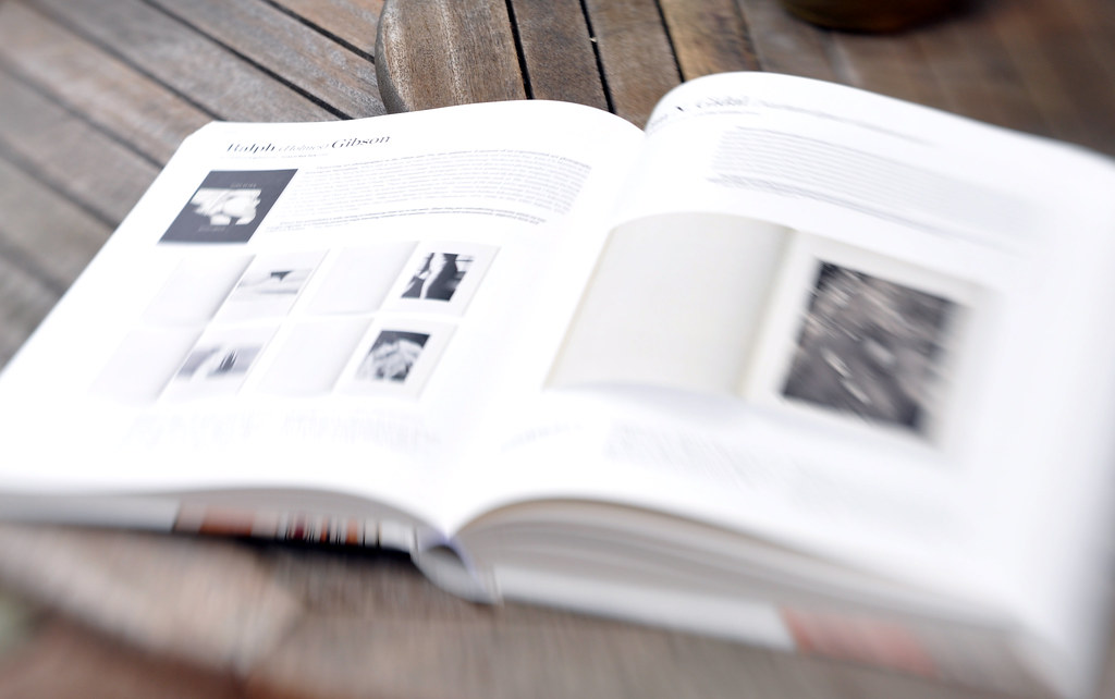
Black/White White, f4, 1/320, 50mm - Lensbaby lens
For the contrasting white image, I took this picture of a book using a Lensbaby lens.  The lens tilts, throwing large areas out of focus and introducing blur to the image.  This blurs much of the greys in the book and really brings out the emphasis on the whiteness of the pages

Rough / Smooth
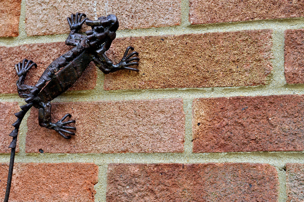
Rough/Smooth Rough, f/6.3, 1/640, 50mm
The Rough image is of bricks, which are instantly recognisable as rough.  I also includes an ornamental lizard made of rusting metal to add another element of roughness and give the image some interest.

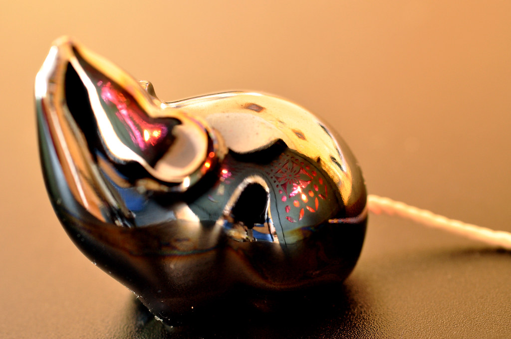
Rough/Smooth Smooth, f/6.3, 1/2, 50mm
The contrasting smooth image is of an ornamental mouse.  This has a smooth metallic finish and to add another dimension to the photo I positioned a lantern close by to give some interesting reflections and emphasise the smoothness.  The long exposure without flash adds warmth to the image.

Heavy / Light
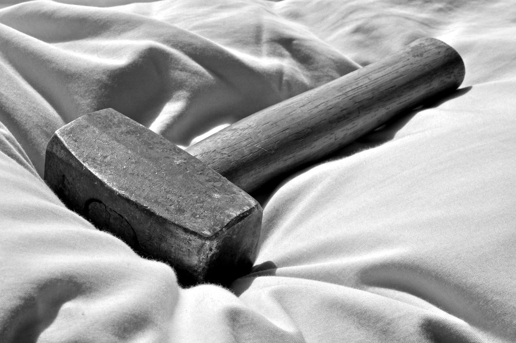
Heavy/Light Heavy, f/20, 1/80, 50mm
The heaviness of the hammer is enhanced by placing it on a soft pillow.  We all know a hammer is heavy, but if it was on a hard surface, we would rely on our assumption that it is heavy rather than any direct visual clues.  The weight can be clearly seen by the way in which the hammer is pushing down into the soft pillow

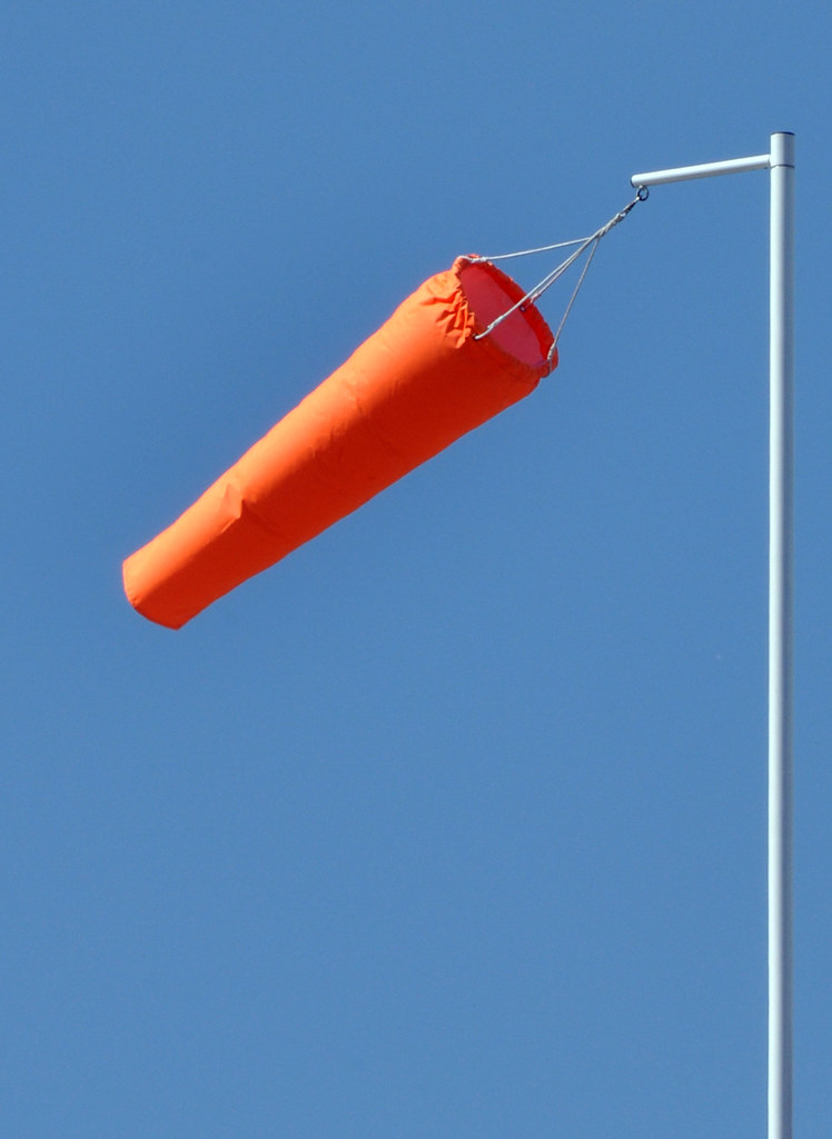
Heavy/Light Light, f/20, 1/160, 200mm
The light contrast to the heavy image is of a windsock.  We can see that the object must be light as it is clear that wind is supporting the windsock and there are no other supports.  By isolating the windsock and it's pole from the surroundings (it's actually on top of a sports hall), we have a very simply, clear image.  The straightness of the pole give a good reference to the position of the windsock itself and hence it's lightness


Straight / Curved
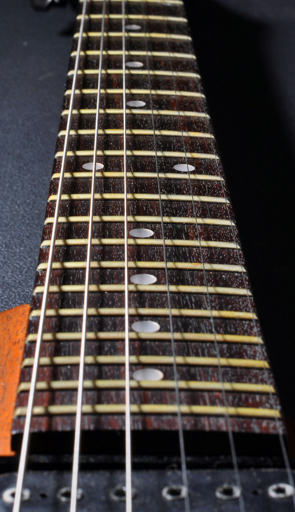
Straight/Curved Straight, f/14, 1/60, 50mm
I chose to photograph the strings and neck of a guitar, the parallel lines of the strings graphically showing their straightness.

Straight/Curved Curved, f/4, 1/250, 10mm
The contrasting curved image is of some stairs underneath a road.  Although there are straight lines in the picture, the spiral curing of the stairs is dominant.  By removing colour, a more industrial feel is given to the image and shows good contrasts, enhancing the curve.


Contrasts in one image - Continuous & Intermittent
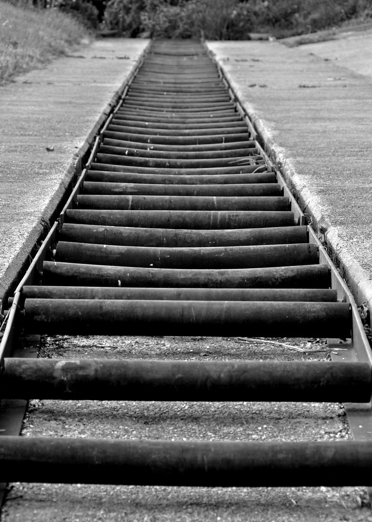
Continuous and Intermittent f/11, 1/60, 135mm

This is an image of a construction to for small boats and canoes to bypass a weir. It consists of a series of rollers, which provide the intermittent aspect to the picture.  This contrasts to the straight, continuous edges.  Additionally, the intermittent rollers, become continuous by repetition.  The use of black and white works well as the subject is falling into disrepair and lends itself to a monochrome image
This assignment was quite a task to complete, but has been time well spent.  Contrasts can be so easily overlooked or assumed and this has encouraged me to look more closely at them for future photography