Saturday 12 March 2011

Pt 1, Ex 8 Vertical and horizontal frames

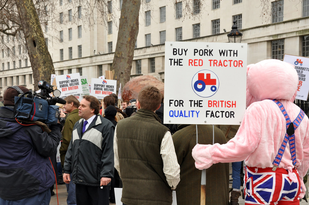
Although this exercise took a considerable amount of time I found it very enjoyable as it forced me to look at all the subjects in a different way.  Previously, turning the camera round was only really something I thought about if I was taking a picture of something tall.  Whilst tall subjects often benefit from a portrait rather than landscape framing, this exercise has taught me that this is not necessarily always the case.  All the images can be viewed in this Flickr set.

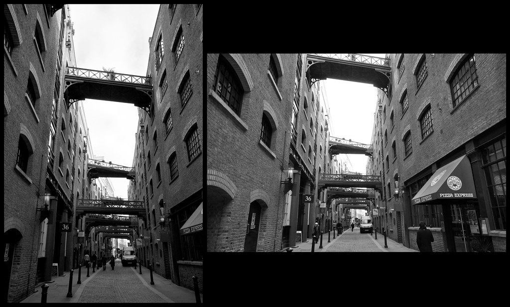
This image is of Shad Thames in London.  The portrait shot emphasises the height of the buildings.  The bridges between the old warehouses give interest to the picture where there would normally be nothing.  The landscape image emphasis the bridges linking the warehouses together.  The landscape image also give more of a sense of depth.  Personally I prefer the portrait image.  I decided to remove the colour from the image as the sky was white and black & white gives a more historical feeling.

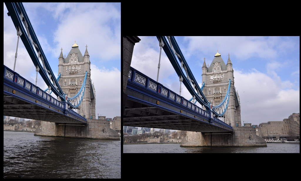
 I took these photos of Tower Bridge from the east side of the south bank.  I was surprised at the results, as although the views are essentially the same, the landscape makes the span look much longer and the portrait photos makes the tower look higher.

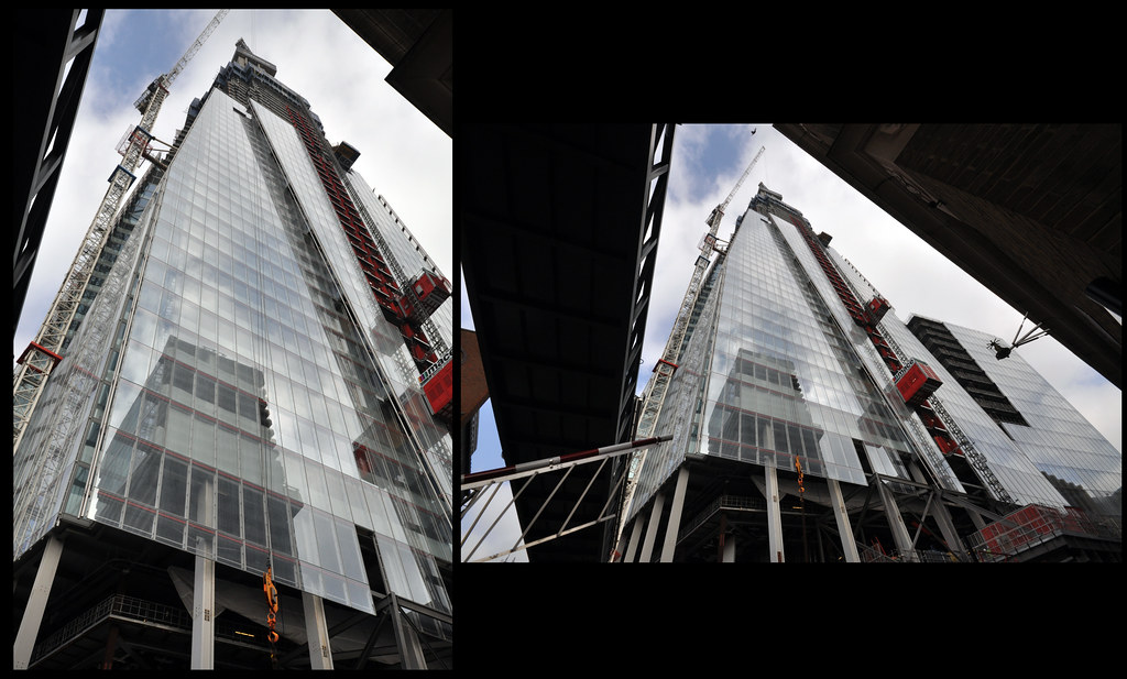
 These photos are of the 'Shard' building in the London Bridge area.  Not surprisingly, the portrait image emphasises the height of the structure being constructed.

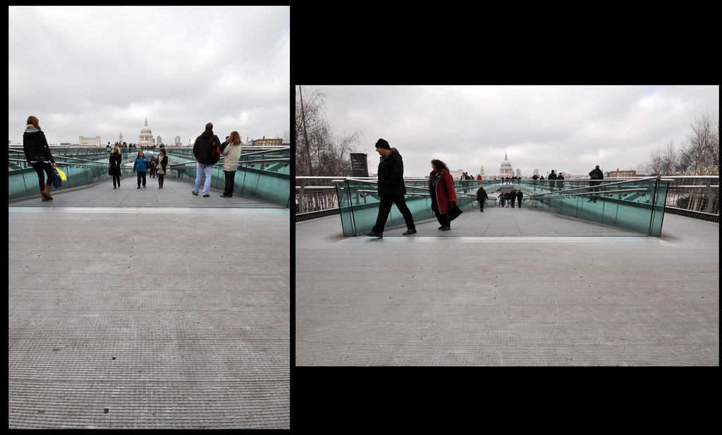
This is the Millennium Bridge looking towards St Paul's Cathedral.  The portrait images doesn't really work for me, whereas the landscape one does as it gives good lines towards the vanishing point.  Obviously a nicer sky would have made a big difference to the vibrancy of the photos!


 St Paul's Cathedral from Peter's Hill shows the iconic building in it's modern surroundings.  The portrait image makes the subject appear to be squashed into it's surroundings, whereas (surprisingly to me) the landscape photos makes it feel less crowded, even though there are more of the modern buildings in view.

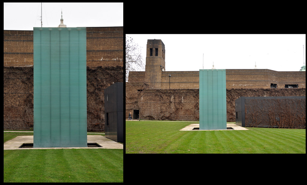
 The National Police Memorial is a simple monument which is a stack of glass rectangles.  The portrait image is fairly stark, whereas the landscape give context to the memorial surroundings - the somewhat bleak and 'cold war like' side to the Admiralty buildings

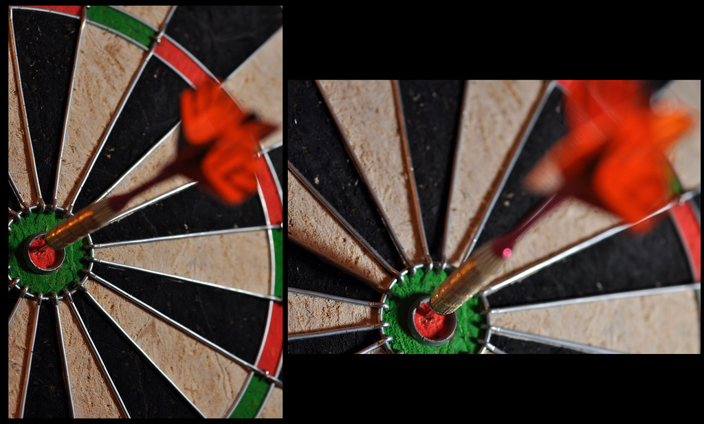
These simple photographs of a dart and dart  board give very different views of the tightly cropped dart.  I was very surprised at just how different these came out, especially that much more of the dart board is visible in the portrait image.  The flash was held off camera and to the right, slightly above centre for the portrait and slightly below centre for the landscape.  This, I felt, gave some additioanl interest to the images and worked better in the landscape version.

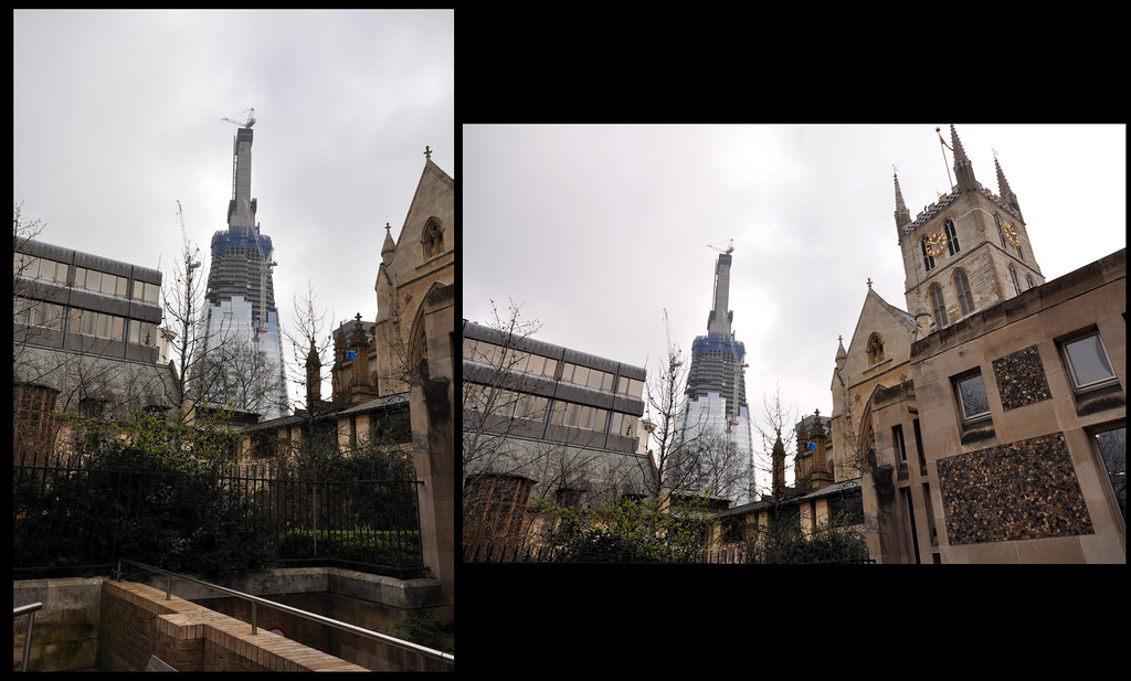
This is the Shard building under construction seen from the grounds around Southwark Cathedral.  the landscape image gives a nice contrast between old & new, although the image has become distorted from the use of a very wide lens.


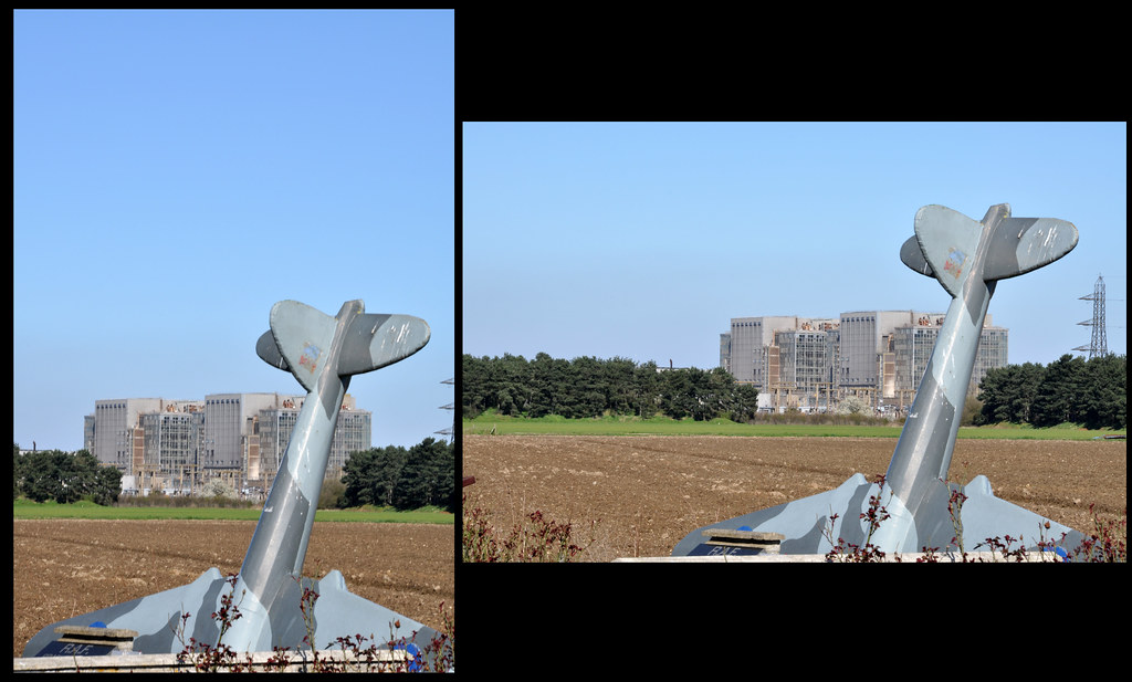
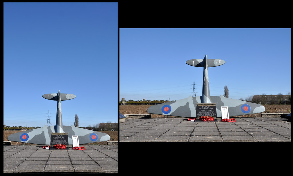
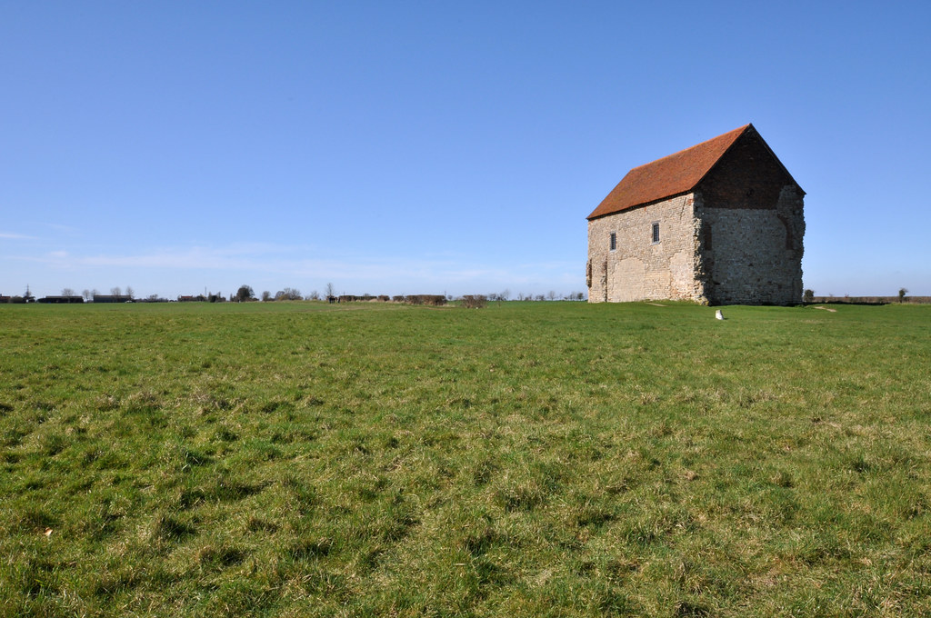
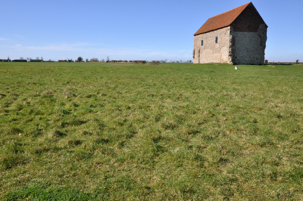
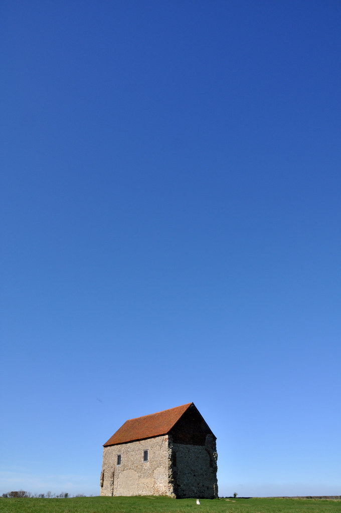
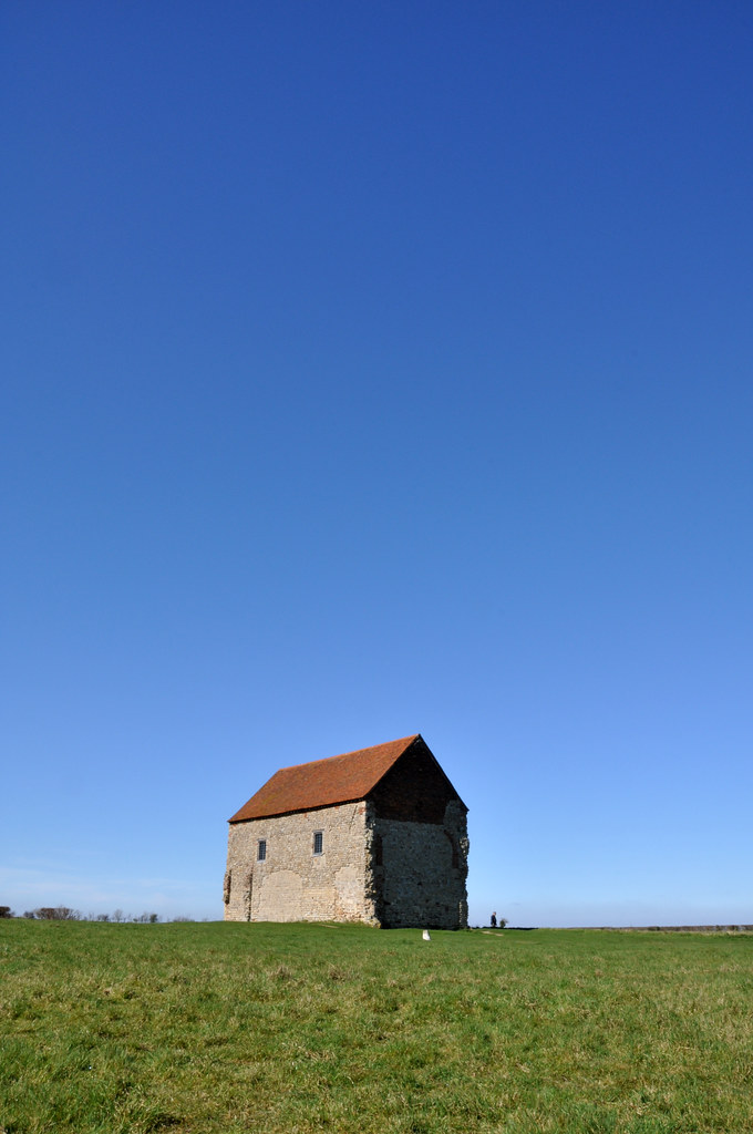
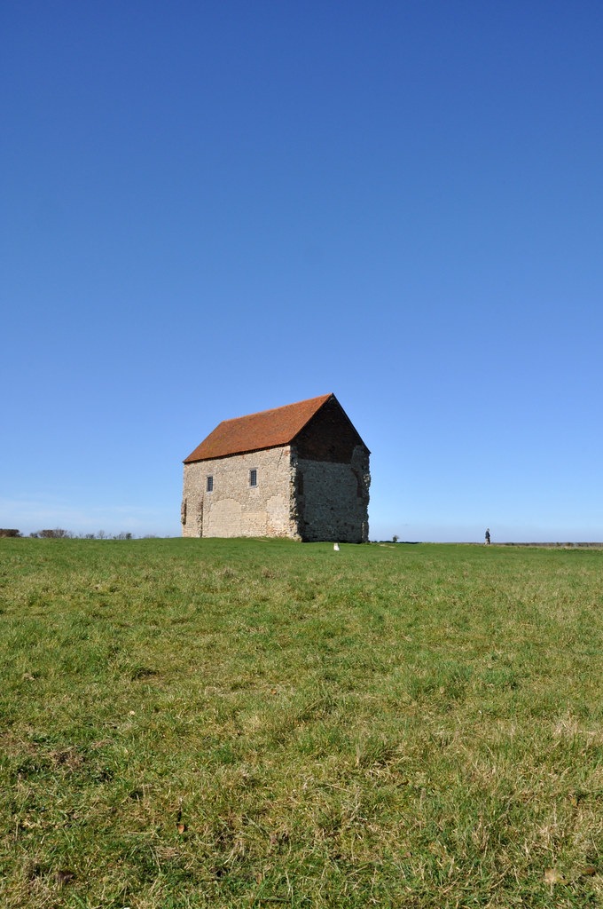
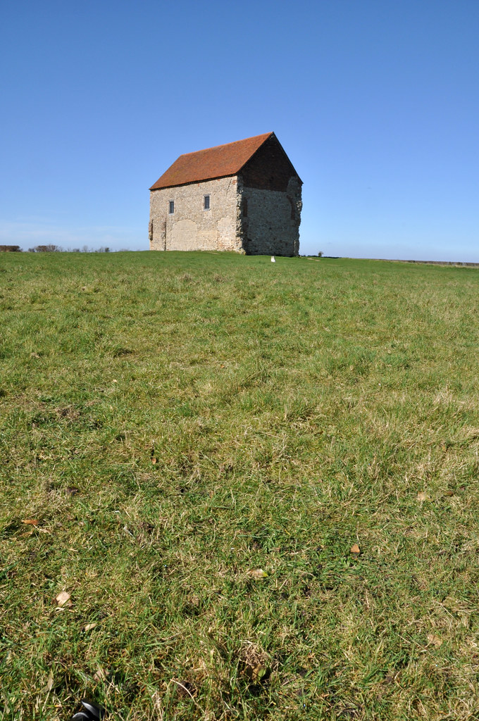
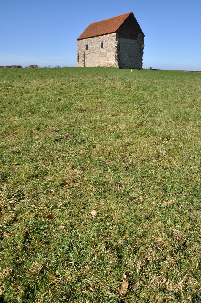
The two sets of images above are both of the memorial at the abandoned WWII airfield at Bradwell On Sea.  The first images were taken with a long lens to make the old Power Station in the background appear closer to the monument.  Of the four images, I prefer the portrait image of the memorial from straight ahead.  The lines of the paving draw the eye towards the subject and the large amount of sky ties the scene into the subject well.


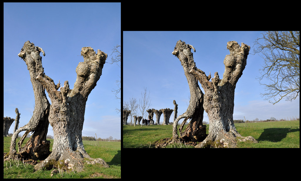
The images above are of ancient decaying Ash trees in a place know as Ash Avenue near Wilcote in Oxfordshire.  I feel that in both case, the landscape images work best as they give the viewer more information relating to the surroundings of the subjects.

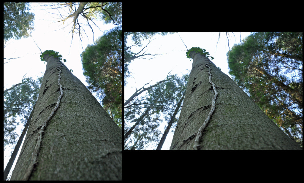
These images are of a root of ivy growing up a tree.  The landscape image doesn't really work that well for me, but the portrait one exaggerates the height of the tree well

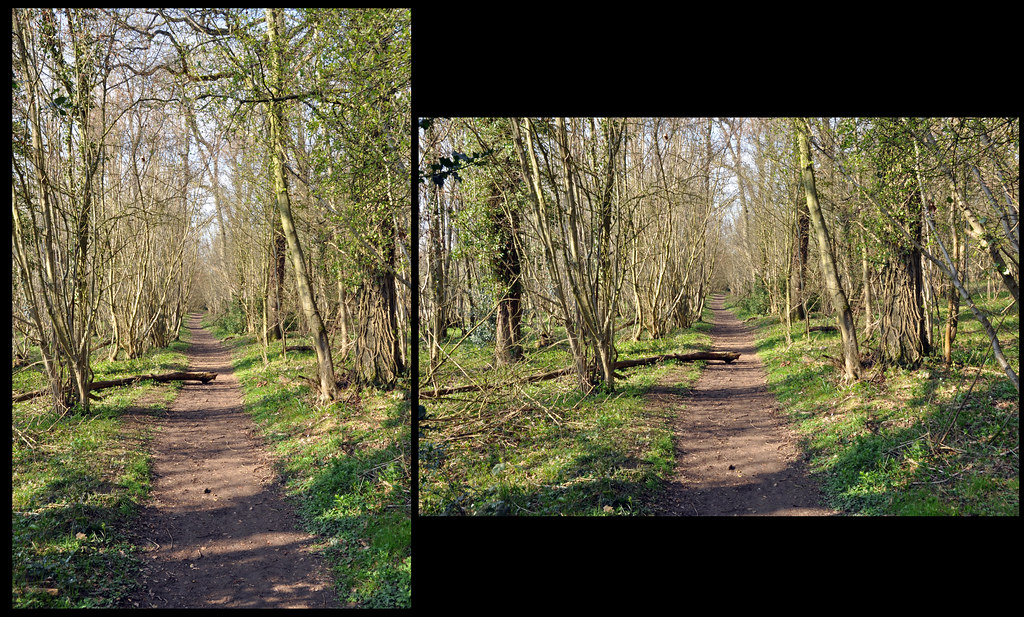
 These photographs of a woodland trail were taken as they have high objects (the trees) and a long flat subject (the path).  The landscape images seems to flatten the path whilst the portrait stretches it and it appears much longer.

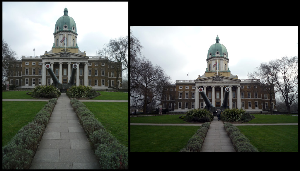
The images above are of the approach to the Imperial War Museum in London.  The portrait photograph lends itself well to the overall image as it elongates the path towards the imposing naval guns in front of the monumental like building.  Interestingly, the guns themselves are not parallel with the path, which detracts from an otherwise symmetric view.  Additionally, the small hedge bordering the path works better as it frames the path and fills the bottom of the frame.  This really helps draw the viewer into the scene.

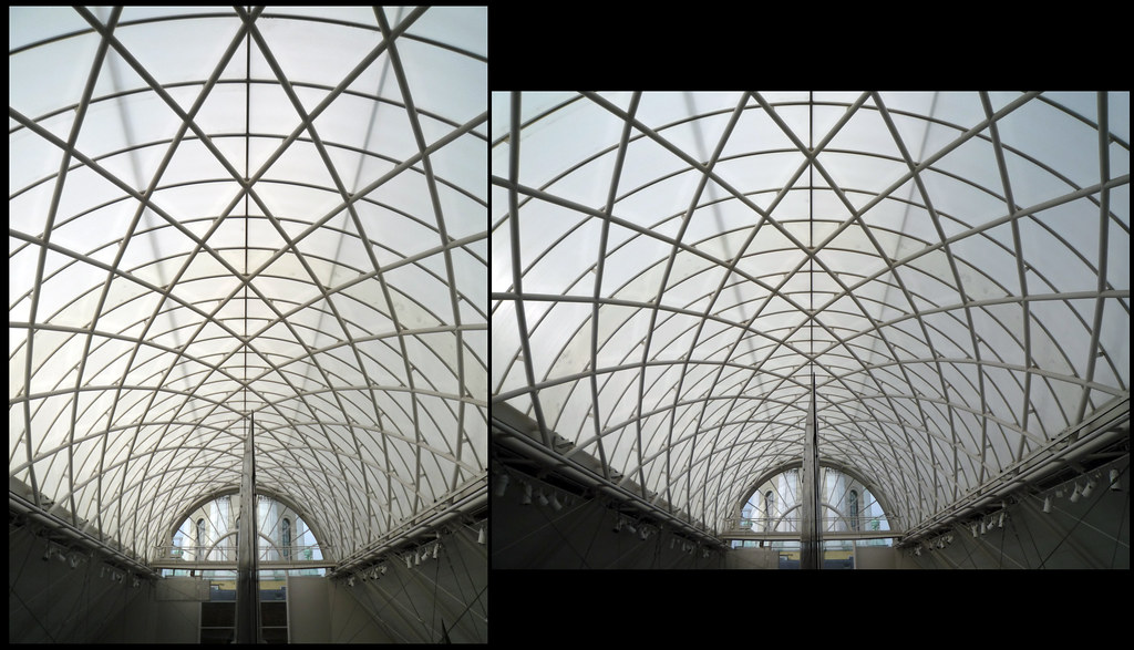
These photographs are of the roof of the exhibition hall at the Imperial War Museum.  Although both photographs were taken from exactly the same spot, the images looks quite different.  The Landscape image gives the illusion of the lattice being wider than in the portrait version, but closer inspection reveals them to be the same.  The landscape version emphasises the span, whereas the portrait image give a more 'tunnelled' feeling.


I was surprised what a big difference turning the camera round could have on fairly normal images and will be taking portrait and landscape images much more frequently now.

Pt1, Ex 7 Positioning the Horizon

I returned to St Peter's chapel in Bradwell On Sea on a sunny day to capture the images for this exercise.  I'd wanted to use the chapel as the subject as I felt it gives a strong image as the building is substantially built, but very isolated and gives a point of interest to the horizon.  The original images can be seen in this Flickr set.

Positioning the Horizon Low.jpg  1/100, f/22, 20mm
 The dominant feature in the first image is the sky, the chapel and the horizon are very low and almost incidental elements of the overall photograph.

Positioning the Horizon Mid Low 1/100, f/22, 20mm
 The next image moves the horizon up slightly.  This creates a more balanced image, and one that is more familiar to the viewer as it becomes more akin to what one would normally view naturally.

Positioning the Horizon Mid.jpg  1/60, f/22, 20mm
As the horizon moves higher up the frame, the dominance is moved to the foreground and the viewer is drawn towards the subject

Positioning the Horizon high.jpg  1/50, f/22, 20mm
As the horizon moves higher the viewer perceives that they are getting lower in this image and there is a strong sense of being drawn into the picture towards the subject.

 I also elected to take the same scene, but with the camera turned 90 degrees. The following images are the result of this and, although the horizon is filling less of the frame, the dominance of the sky and foreground is magnified.


 Off all the images, I much prefer the ones with the subject at the bottom of the frame, largely because of the big blue sky in the images and the simple building.  Usually I prefer horizons to be high in the frame, such as in the photo below I took late in the day a few years ago.  This works as there are areas of interest in the foreground and this contrasts with the plain sky.

I feel that the the two positions of horizon that work best for me are a low one where there is a simple subject or one where you want to emphasise height and high horizons where there is an interesting subject in the foreground

Sunday 6 March 2011

Pt 1, Ex 6 Balance

I found this exercise difficult to start with as I hadn't really consciously considered balance in photographs, but relied on what 'looked right'.  Obviously there are no rules as such and what looks right is important, but this has taught me to look further at subjects and consider the balance as a part of the overall composition.

I've used 6 photographs that I've previously taken and indicated where I think that areas of balance occur.  Some of these were quite simple to identify (Balance 1, 4 & 5) and the others more complex.  At first I struggled to identify the balance in the other images, but then found that I was drawn to parts of the images, and that those parts formed the balance .

The original images are available in this set on Flickr

Balance 1.jpg 
Balance 1a.jpg
The balance is easily identifyable by the symmetric nature of the image.  The propellors balancing out the dominent nosecone.

Balance 2.jpg
Balance 2a.jpg
The Iron Bridge was more complex, but by noting the areas that caught my eye, I was able to identify the balance in the image.  I've included the detail at the highest point of the bridge as I feel this locks elements together.

Balance 3.jpg
Balance 3a.jpg
The bike splash photograph was challenging, but the relationship between the bike frame, the riders legs and the rear wheel tie the image together, forming a 'W'.

Balance 4.jpg
Balance 4a.jpg
The windmill is slightly off balance, but I don't feel it is any less of an image for it.  The bold strong brickwork on the right leads to the slender sail, giving a balance to an otherwise one sided image.

Balance5.jpg
Balance 5a.jpg
The ruined Welsh barnis a quite symmetric image and the balance reflects this.

Balance 6.jpg
Balance 6a.jpg
The waterfall was more complex to identify the balance in.  The edges of the river banks balance left to right, whilst the two falls of water balance top to bottom.

Pt 1, Ex 3. A Sequence of Composition

For this exercise, I headed to London with the idea of heading to the usual busy places with lots of people.  Unfortunately a combination of areas being set up for events and a overcast cold day seemed to keep most people away, but I was lucky to find a small demonstration in Whitehall, opposite Downing Street.  The full size pictures can all be viewed in this Flickr set.  The act of capturing these images was quite enjoyable, and not something I'd done previously.  It was also more demanding than I expected it would be as I was constantly trying to find points of interest whilst avoiding collisions as I kept looking through the viewfinder.


SOC1.jpg
The first photo is as I approached the scene and shows a TV crew beginning to set up
SOC2.jpg
In this photo I included the view of the London Eye in the to give some interest in the background and clues to the event's location
SOC3.jpg
Moving along, I noticed a TV reporter  doing a piece to camera.  I made sure I included some of the placards in the background to give context to the the image

SOC4.jpg
Pulling back from the reporter, the 'pig' and his sign become dominant, but the reporter is still visible and imparts the newsworthiness of the event
SOC5.jpg
Moving around the TV crew, I continued taking photos.  This is a pretty dull image, but tracks my progress around the event
SOC6.jpg
Moving on slightly further, I found what appeared to be on of the focus points of the protest, with the man in black (back to us) leading the protesters
SOC7.jpg
Moving round to focus on the the man leading this part of the protest, I captured this image.  Whilst a poor image technically (poor light lead to slower shutter speeds), it is a good capture in the context of the subjects. Two demonstrators are clearly captivated by the man leading and enjoying the event.
SOC8.jpg
Moving further along the line, we get more context as to the protest.  The large banner clearly states the purpose of the protest and the man in the Hi-Vis tabbard is organising people.
SOC9.jpg
Moving back towards the centre of the protest now and we can see people looking towards a common point
SOC10.jpg
...and that central point is our leader again.  This time leading the protesters in singing.
SOC11.jpg
..and here we see him encouraging a response from his audience
SOC12.jpg
Turning round I noticed the statue of Montgomery.  The contrast between military discipline and the random nature of the protesters works well (although the statue is a bit underexposed) as does the relation between people expressing their freedom and someone who fought for it
SOC13.jpg
Turning to the right I noticed a sign saying 'Sign Our Sausage'
SOC14.jpg
...and turning a bit more to the right, I captured press photographers covering the event.  I notice that they all had flashes mounted to their cameras.  If only I had had mine with me as the light was really poor - a lesson learnt!
SOC15.jpg
I then noticed a man to my left - mainly because he was facing the opposite way to everyone else and concentrating on a phone call rather than anything else.  The T-shirt under his jacket the only clue that he was part of the protest
SOC16.jpg
..but the phone call was clearly making him quite animated.
SOC17.jpg
Moving round to the right of the protest to seek new views, I found someone giving an interview
SOC18.jpg
Zooming out give a sense of the seriousness of the message being communicated
SOC19.jpg
Turning to the left, I captured the press contingent again.  The wall between the press & protesters serves as a physical barrier between the two sides.
SOC20.jpg
Moving on to the far side of the protest I came across this individual.  He appeared to be on his own and slightly removed from the main group - possibly because of the somewhat questionable phrase he has put on his placard.
SOC21.jpg
Finally I saw this man, completely on his own, talking into a mobile phone.  He appears to be taking part in the protest somewhat reluctantly and was keen to be on his own.  Perhaps he was complaining to someone on the phone